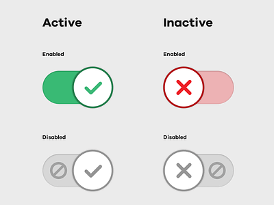
Checkbox switch UI with disabled affordance Icon
A UI example I designed for a checkbox switch-style element. I've included additional features to provide better visuals when the checkbox is in a disabled state.
Our previous effort was simply to dim the switch using opacity, but I was deeply unhappy with it. Our second attempt included the use of a padlock icon, but this was was confusing as a padlock is normally synonymous with security or privacy, and so I resolved to redesign our humble checkbox switch - the 'ban' icon is better associated with a non-performable/not allowed action (similar to the 'not-allowed' cursor value in CSS) and so better matched what we were trying to convey.
Live example:
http://codepen.io/adamstuartclark/pen/EKJWRx
More by Adam Stuart Clark View profile
Like
