Orchestre d'Harmonie de Rennes - Logo

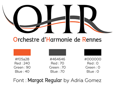
Design of a logo for the Orchestre d'Harmonie de Rennes.
The grey wave stands out from the black while being part of the letters as it shapes the bar of the H and the "leg" of the R.
The orange colour reminds good mood and the pleasure to listen to music.
Download the Margot font for free here : https://www.behance.net/gallery/margot-free-font/13819879