Cu-Cu - logo concept
As with any design process, sometimes a design just doesn't make the cut.
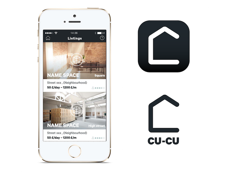
For Cu-Cu we tried to create an icon with imagery from the rental market, whilst at the same time subtly referencing the abstract name of the app. The result was a bold, memorable icon which, when combined with the app, makes perfect sense.
Storytelling in an app icon isn't essential. Even some of the biggest apps opt out (think Chrome, Spotify, Uber, Pinterest...). And even more prefer to use a single letter or even the entire name of their app instead of something more creative (we're looking at you Facebook, Etsy, Skype, LinkedIn). But when it's done right, it can make a huge difference. Imagine Tinder without its steamy flame icon. Or Citymapper without its simple but beautiful point-to-point icon. And despite all the controversy around Instragram's new logo, they still managed to breathe life into a very simple storytelling icon.
At Gorilla Arm we believe that icon's should tell stories. And that isn't an easy recommendation to pull off every time. Sometimes the subject matter of an app is so broad that a single type of image isn't going to work for all situations. That's exactly what happened here with Cu-Cu. This icon, whilst referencing the rental market with its use of a house-shaped icon, actually undermined the variety of spaces that Cu-Cu aimed to offer its users. Basements, garages, shops, office spaces - none of those were represented. And so to avoid polarising people's expectations that this is an app for finding housing, we decided to opt for a different design.
We still think it's a pretty good icon though. 😀
