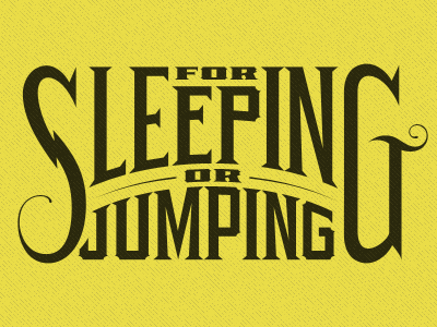
Lettering on a curve
"S" and "G" were tweaked to be more cohesive and follow the same rules. The arm in the "G" was given a swash feature to match the "S". Stokes on each side of "OR" were also given this swashy hairline and ink buildup.
More by Alex Sheldon View profile
Like
