Tecoters - Brand Identity for Startup Digital Agency

Tecoters
Tecoters is a creative digital brand focused on tech, design, and development services. The goal of this branding project was to build a modern and professional visual identity that feels clean, digital-first, and globally recognizable. This project was fully designed by me — from sketches to final presentation.
Mission
To support designers, developers, and tech users with high-quality digital solutions and a reliable brand identity.
Vision
To become a trusted brand in the digital space, known for simplicity, performance, and design clarity.
Brand Strategy

Concept & Creative Process
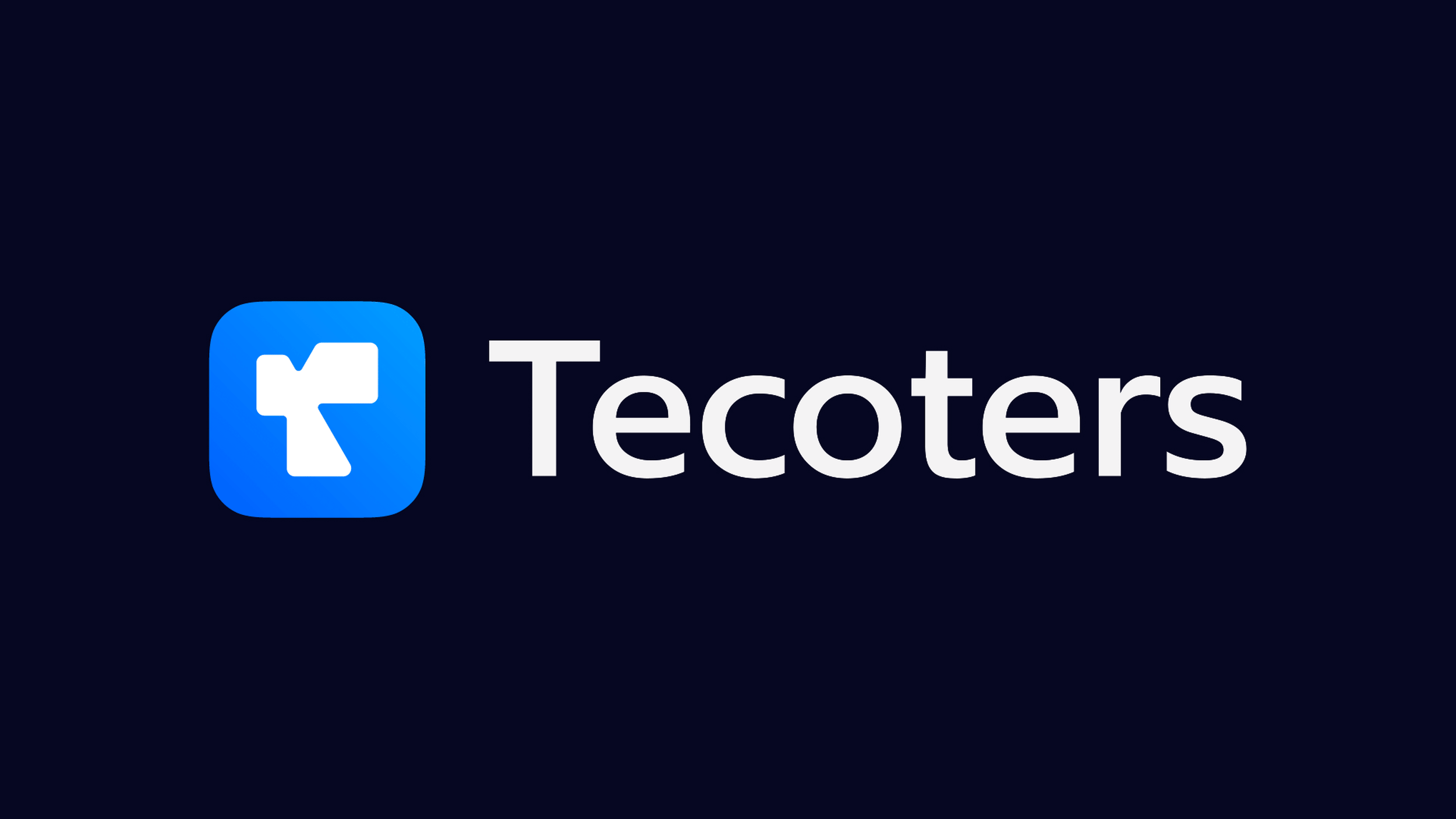
The Tecoters logo combines the letter "T" with a cursor symbol, reflecting both the brand’s name and its focus on digital design and usability. This concept represents tech interaction, functionality, and visual clarity. The process began with hand sketches exploring how to merge the "T" with a pointer icon. After several refinements, a clean and scalable icon was finalized. Custom typography was then selected to match the modern and approachable tone. Colors were chosen from tech-inspired blues and dark neutrals to create a trustworthy and digital-first identity.


Final Design
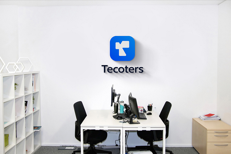
The final identity includes a flexible icon, a custom wordmark, and multiple logo lockups.The mark works well as an app icon, social media avatar, or monogram.It also scales clearly in both color and black-and-white versions.


Color Palette
Tecoters’ color palette reflects its tech-driven, modern identity. The primary blue builds trust and clarity, while the accent blue adds energy and motion. A deep navy grounds the design with a sleek, premium feel. Light gray ensures balance and readability. Together, these colors create a clean, vibrant, and professional visual language.


I'm available for your project — feel free to reach out!
Say hello. 📧 ↗ Get in touch
© Tajul Islam Nahin 2025. All rights reserved.
