Sous Le Pont logo
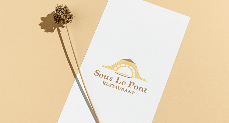
Sous Le Pont means "Under the Bridge".
The Brief
I was approached by a client on Behance to design a logo for their restaurant in Bern, Switzerland. A cozy and inviting restaurant located under a bridge, offering a unique and charming dining experience.
The client specifically mentioned wanting a more artisanal, illustrated style logo. It should reflect the restaurant's atmosphere—warm, elegant, and slightly rustic with a modern twist.
The idea
I researched the place and made some sketches to combine what the client wanted.
After exploring some options, I came up with this direction – which was approved by the client:
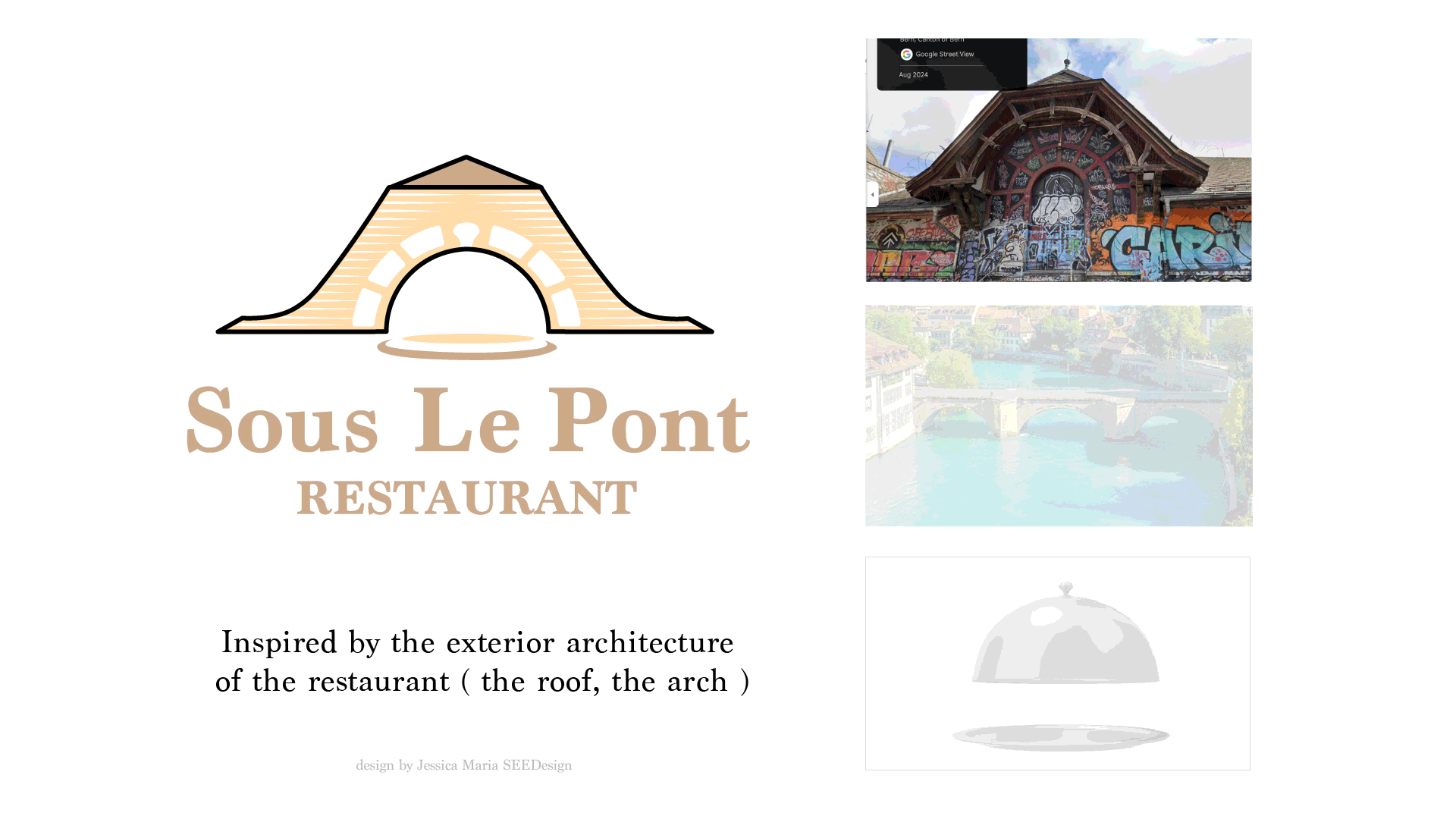
The logo is rendered in a woodcut / linocut illustration style to give it more handcrafted and artisanal feeling.
The text is using a transitional serif font that combines tradition and beautifully crafted charm, creates a note of industrial effect that fits the restaurant interior and give the logo a touch of vintage attractiveness.
The color palette of gold and bronze color convey the warm atmosphere of the restaurant while still maintaining elegance and giving it a classy look.
As a casual dining restaurant near the bridge, my intention for the Sous Le Pont logo is to leave a lasting impression that shows their uniqueness (under the bridge) in a charming vintage classic style while still looking modern and casual.


