Brightnest - Edutech Landing Page UI
Hello Creators 👋
Press 💜 if you like the design and do share your feedback!
🎨 BrightNest – UI Design for Empowering Young Learners
This UI was designed to balance playfulness with purpose, creating a safe, engaging, and structured environment for early learners and their parents. The goal? To make the platform feel as approachable and nurturing as the educators behind it.
🧡 What we crafted:
A warm, friendly color palette that builds trust and emotional connection
Rounded typography and soft visuals to maintain a child-centric tone
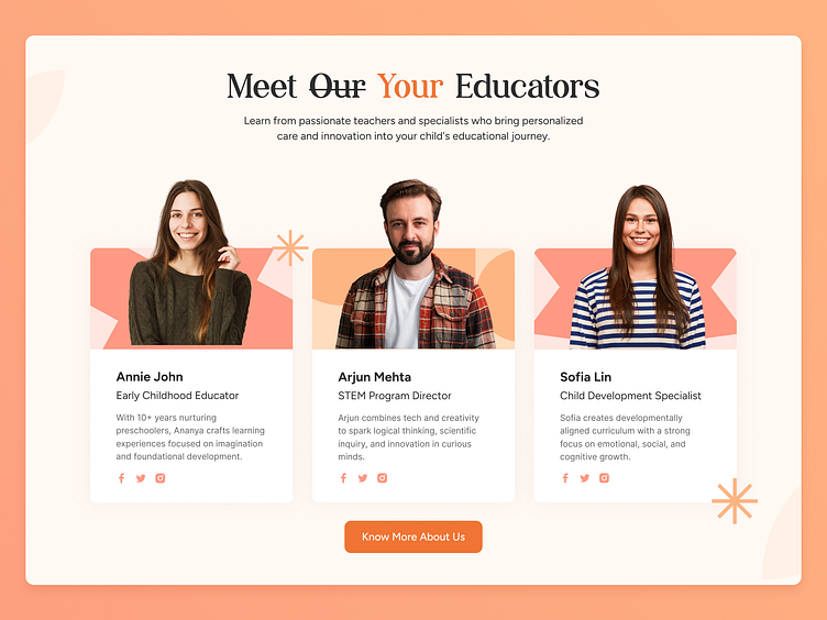
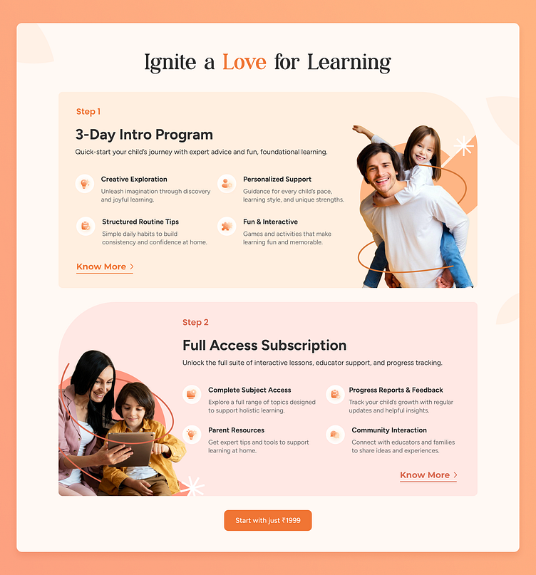
Clear information hierarchy for parents to easily discover programs, benefits, and educator profiles
Modular sections tailored for storytelling, service explanation, and user decision-making
Illustrations and images chosen to reflect diversity, warmth, and real impact
💫 And then, we animated it — to breathe life into each section. From micro-interactions to fluid transitions, animation was used as a guide—not decoration—to enhance comprehension, engagement, and retention.
This UI is more than a website—it's an onboarding journey into a child’s brighter future.
👇 We’d love to know what you think!


At ProCreator, we're passionate about transforming the digital landscape with meaningful and resonant design. As a global leader in UI/UX, we bridge the gap between user needs and technological possibilities, crafting not just products but experiences that amplify user satisfaction and business outcomes.
Got a design challenge for us?
Drop us a line – let's make something incredible together!
Reach out to us on: