Rubia Dutch Conversation– Brand Identity & Manual

Rubia Dutch Conversation and Rubia Support is a family-rooted organization focused on empowering multicultural communities through support, care, and learning. The brand needed a clear, cohesive identity to reflect its values and mission across all platforms.
Scope of Work
I developed the full visual identity and brand manual for Rubia Support, creating a professional yet emotionally resonant visual system. The deliverables included:
Logo Design (Primary and Alternate Versions)
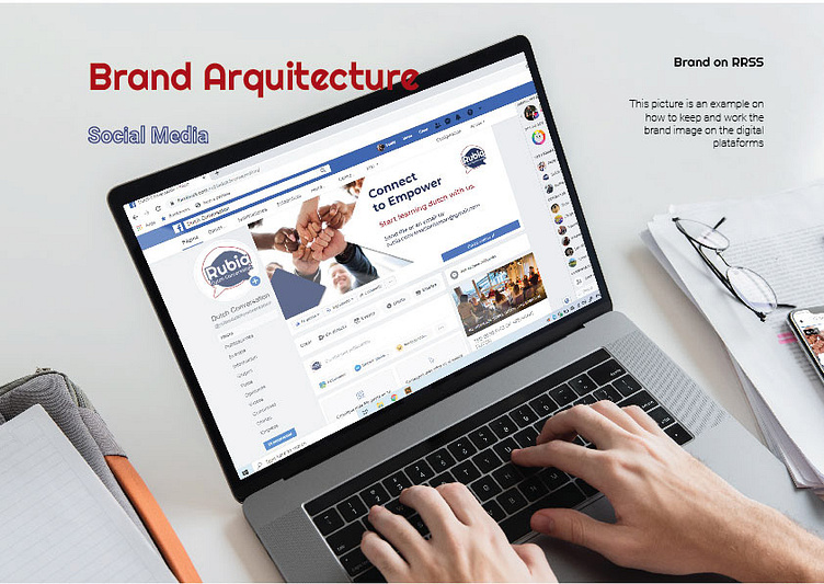
Brand Architecture & Visual Guidelines
Typography System (Righteous + Roboto)
Color Palette (Pantone-matched values)
Stationery Concepts
Brand Use on Photography, Illustrations, and Social Media
Logo Scalability and Clear space Rules
Slogan Design: "Connect to Empower"
Design Approach
The goal was to visually communicate Rubia’s values of family, multiculturality, support, and resilience, while ensuring the brand stays consistent across digital and print media. The manual was designed to serve as a practical, user-friendly guide for any future communications.