Micro Interactions Hub - Motion Design Study
I built this one-page motion sandbox to show how micro interactions can turn a basic UI into something way more intentional (and fun to use).
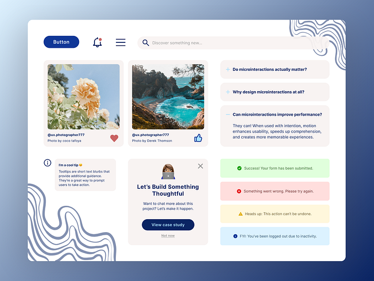
I treated this like a motion-first component library with each piece working together. Same vision, same system.

What’s all in here?
Left Side
A CTA button that reacts to clicks and hovers
A playful, swinging notification bell with an eye-catching dot
A hamburger menu that transforms into an “X”
Social cards with animated like/heart buttons
A floating tooltip & custom modal
Right Side
A search icon that expands into a full input
Sleek FAQ accordions that open and close cleanly
A stack of toast notifications (Success, Error, Warning, Info), all with color-coded icons and motion you can actually feel


Every animation was designed with purpose. I tried to avoid adding motion for motion’s sake.
Instead, I focused on creating interactions that feel intuitive, smooth, and system-aware. Things like easing curves, entry/exit timing, and motion hierarchy were all considered to support clarity, not distract from it.
The goal? Make every action feel a little more human and a lot more thoughtful. ✨


🎨 Tools: Figma
🎯 Focus: Motion design, interaction design, system behavior
🧠 Goal: Showcase how small, intentional animations can bring a unified product system to life while making every interaction feel thoughtful, usable, and human.
Interested in my work?
🔗 Check out my Canopy Atlanta shot.
