Heno de Pravia soap rebranding
The Heno de Pravia soap rebranding forms part of my rebranding projects for already existing brands. These projects are not sponsored by those brands and were created purely for non-commercial and hobbyistic reasons.


Heno de Pravia is a Spanish soap brand with a decade-long history on the market and a base of loyal clients. The history of the brand dates back to 1905 and the iconic smell of the soap is for many the smell of home, as the slogan of the brand itself says.


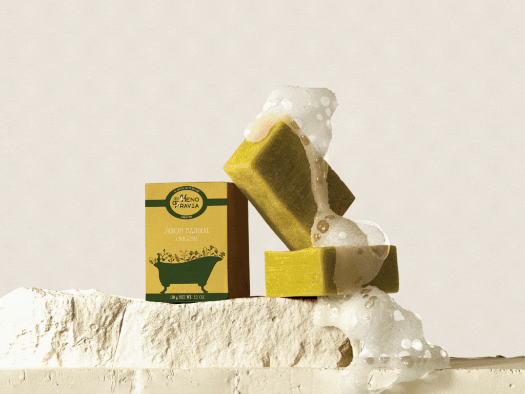
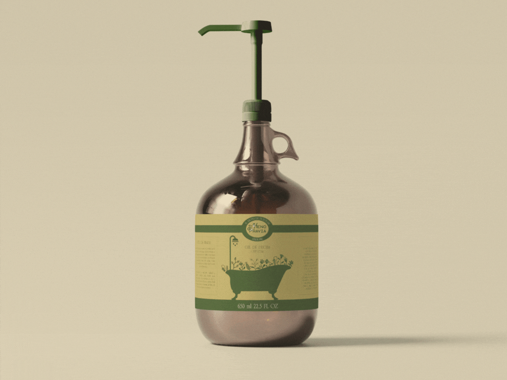
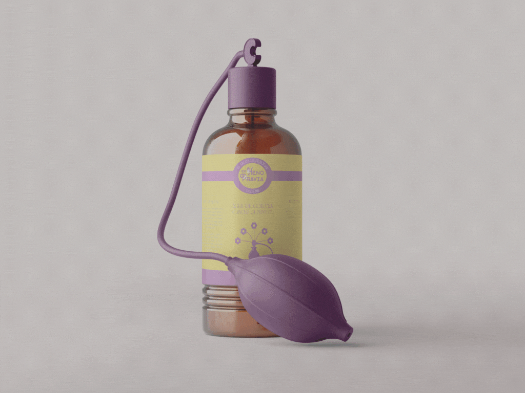
Heno de Pravia mainly make soap bars, shower gels and eau de Cologne. The packaging is simple and the logo very minimalistic and rather generic. With this project, I decided to to the exact opposite of what I usually do, and that is: bring back the detail and demodernize the visual identity.

I decided to go for a rustic and ornamental style, reminiscent of secession. My inspiration were old Heno de Pravia ads and packaging, as well as soap ads from the 60-90s. Apart from the full logotype, there will be a simplified version to be stamped onto the soap bar itself.


The floral motifs, also present in the packaging design, are a more maximalist version of the idea of Pravia meadows and freshly cut hay, the inspiration behind the Heno de Pravia creation.


As far as the colors, the green and yellow proceed from the original logo, and other colors in a similar hue were added by me based on other Heno de Pravia products and existing packaging.


Apart from changing the Heno de Pravia visual identity, I decided to also go for more vintage-looking packaging for the shower gel and eau the Cologne. This creative decision further reinforces the new "demodernized" look and complements the secession packaging design.
Mockup sources
Hand holding soap bar from Mockup Daddy
Soap bars on stone from FreeDesignResources
Shower gel bottle with pump from MockupFree
Cologne bottle with atomizer from Resource Boy
