Entrepinares cheese rebranding
The Entrepinares cheese rebranding forms part of my rebranding projects for already existing brands. These projects are not sponsored by those brands and were created purely for non-commercial and hobbyistic reasons.
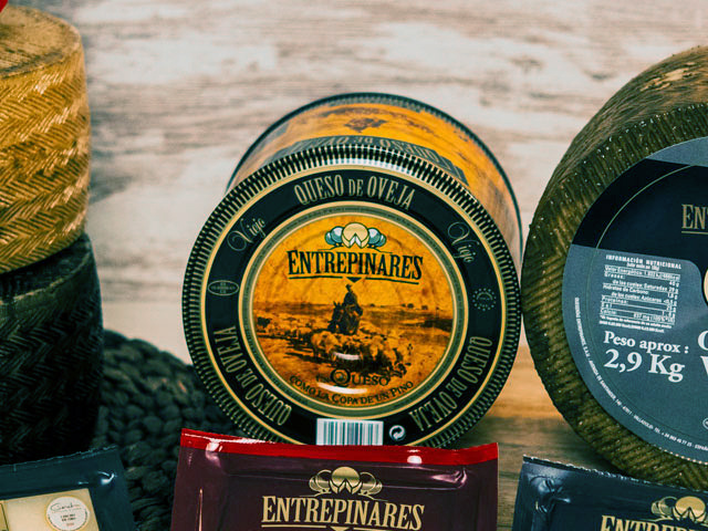
Just like Acor, Entrepinares is another Spanish staple and a well-established brand in the dairy sector with various production plants across spain and presence in 35 other countries. Entrepinares offers a rich catalog of cheeses and other dairy products, with a recognizable logo featuring the characteristic pine trees from the Valladolid region.


Motivated by my love for cheese, I set out on another redesigning journey with this brand to clean up the logo and packaging a bit, and make it more modern and less crowded. The logo has too many elements and line thicknesses, and the pine trees behing the cheese wheel do not really resemble pine trees. The letter "Q" in the slogan features is unnecessarily complex and may not be visible in smaller formats. My proposal for the revamped logo is the following:

The lines and fonts are simplified for better readability across formats. The complex illustration of a cheese wheel surrounded by pine trees is also significantly simplified to a more symbolic representation. The new version combines the image of a round pine tree with that of a cheese wheel with a slice cut out of it. The new logotype preserves the structure and information of the old logo to still make the cheese recognizable on store shelves, but gives it a significant visual upgrade and a modern look.
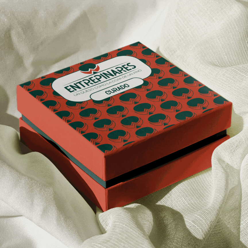
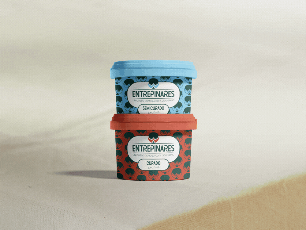
The recycled paper packaging is sturdy and easy to stock on shelves. The tree part of the Entrepinares logo is always dark green just like in the original, and the cheese part changes its color based on the cheese type. Some cheese types and their corresponding colors are inspired by the original Entrepinares packaging and others were created by me. The colors helps customers recognize their favorite cheese type on the shelf.
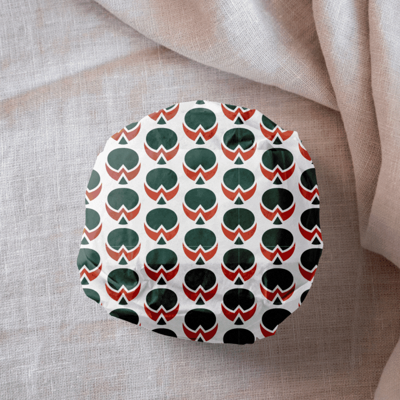
Inside the box, the cheese is wrapped in a paper tissue with the simple brand pattern printed on it. Just like on the box, the logos on the wrapper change color to match the cheese type. This design solution for the packaging is very versatile and adaptable, and it joins all products by this brand under one umbrella of cohesive and easily recognizable design.

The company trucks and buildings also get a new look, with a bold dark green color and a very visible and well readable logotype.


Mockup sources
Logo on paper from Pixelbuddha
Cheese box from Mockupbee
Cheese wrapper from Mockupbee
Cheese slices packaging from Gustavo Comunello on Behance
Cream cheese packaging from Graphicpear
Building mockup from MrMockup
Truck mockup from Good Mockups
