Acor sugar rebranding
The Acor sugar rebranding forms part of my rebranding projects for already existing brands. These projects are not sponsored by those brands and were created purely for non-commercial and hobbyistic reasons.

Acor is a Spanish sugar product brand that has been on the market for decades. The logotype and packaging are recognizable but I decided to give them a little makeover. My main focus will be the logotype and the color palette. I find the current Acor logotype slightly confusing and disproportionate, and the packaging design inconsistent and too busy.
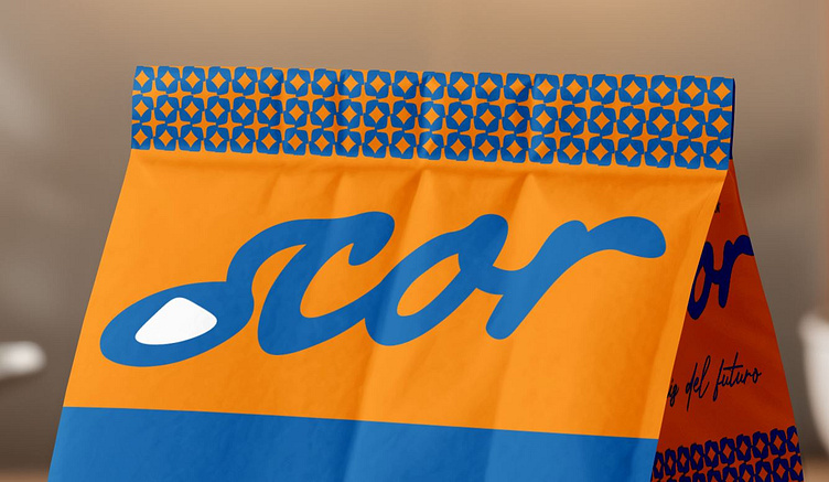
I decided to preserve as much as possible of the original logotype due to the brand's recognizability and homestead staple status. I retraced the last three letters and replaced the original "a" with a shape that resembles a teaspoon with a mound of sugar on it. This logotype is still similar enough to the old logotype to facilitate brand recognition but modified enough to make what Acor produces clear enough. The overall logotype silhouette is now more balanced verticallty and horizontally.

In order to introduce another easily recognizable element to the packaging, I created a simple pattern to be featured on all packaging and other brand communications. This geometric pattern looks vintage but modern at the same time, and can adapt its colors to various needs. The fonts that spell out the name of the product and other technical information are simple serif and script fonts that are readable and practical but also playful and decorative.


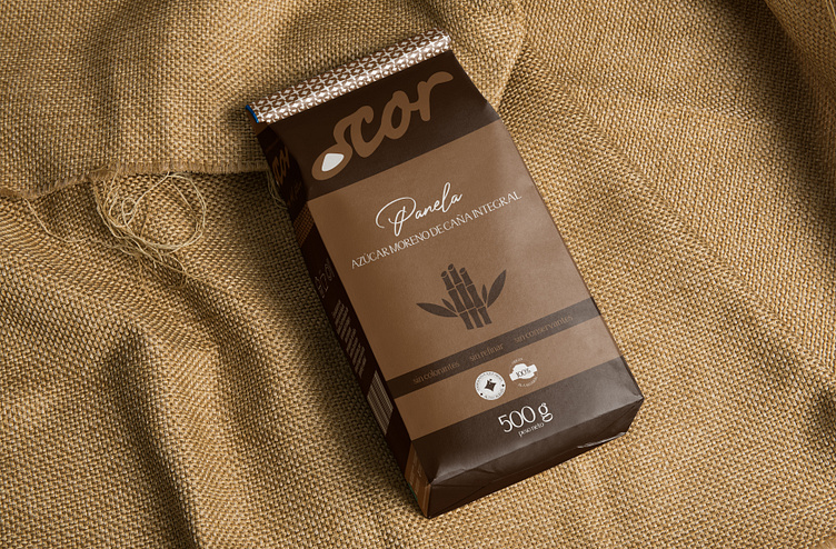


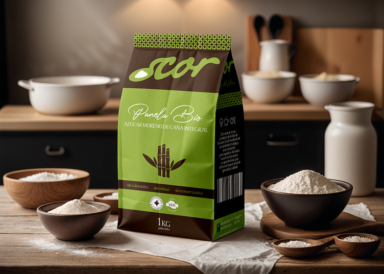

After thoroughly studing the sugar varieties and formats in Acor's offer, I created a simple color scheme for the 5 main types of sugar that will be used throughout the formats. This will not only facilitate the quick identification of each sugar kind but also restore consistency within the brand.

The sugar beet and sugar cane illustrations complete the packaging and give it a rustic and wholesome look. The icons and below are elements present on the original packaging, either original (Tierra de Sabor logo) or created by me for the purpose of this packaging project. Apart from the buld 500 g and 1 kg paper packaging, the Acor offers special pastry sugar. My packaging proposal are carton cylinders with a hermetic cover - easy to store, use and recycle.

This specialized pastry sugar comes in two formats: pearls and powdered sugar for glazing. Each packaging has a different color and is decorated with different illustrations for each type of sugar to facilitate identification on store shelves and in the pantry.


For those who prefer sugar in cube format, Acor offers sugar cubes (only white and brown cane sugar) packed in thick recycled paper bags. For the hospitality and catering sector, white and brown sugar are also available in stick and packet format, also packed in sustainable, thick paper bags.


Mockups sources
1 kg paper bag from Gitu
0.5 kg paper bag from Unblast
Paper can from Pixpine
Paper bag from MrMockup
Sugar sachet from Free Mockup World
Sugar stick from Mockup Daddy
All images sourced from Pexels
