Taboo perfume

Taboo is another fictional brand I created. It is a high-end perfume brand that is not afraid to shock, scandalize and raise eyebrows. The scents are raw and controversial, often including hints of bodily fluids or smells deemed unpleasant or taboo by most.

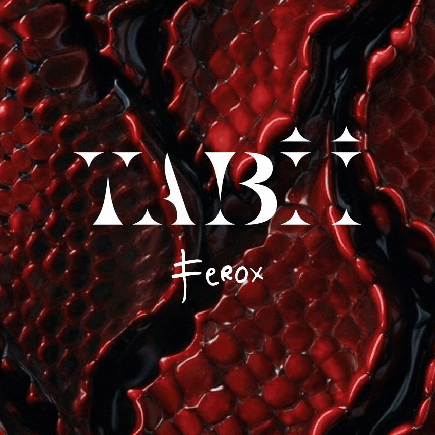
The logomark and logotype were created by modifying the chosen font to reflect the intended brand personality: bold, dark, dangerous and tempting. The scent names are typed out in a contrasting script font that resembles hasty scribbles.
The colors chosen for each scent are not accidental. They represent the main notes present in each mix, and together they create a very visceral and gloomy color palette that perfectly represents the brand's overall mood and target audience.
The perfume packaging is minimalistc but bold and memorable. Each perfume bottle features a moody photo and comes with an elegant recycled paper box. The packaging is gender-neutral and will look great in anyone's perfume collection. The frosted glass is pleasant to the touch and the soft recycled carton box further enhances the user experience.


The scents are advertised individually because they are unique and target different audiences. The advertising includes stylish magazine ads, eye-catching billboarads in public spaces and artistic TV commercials.

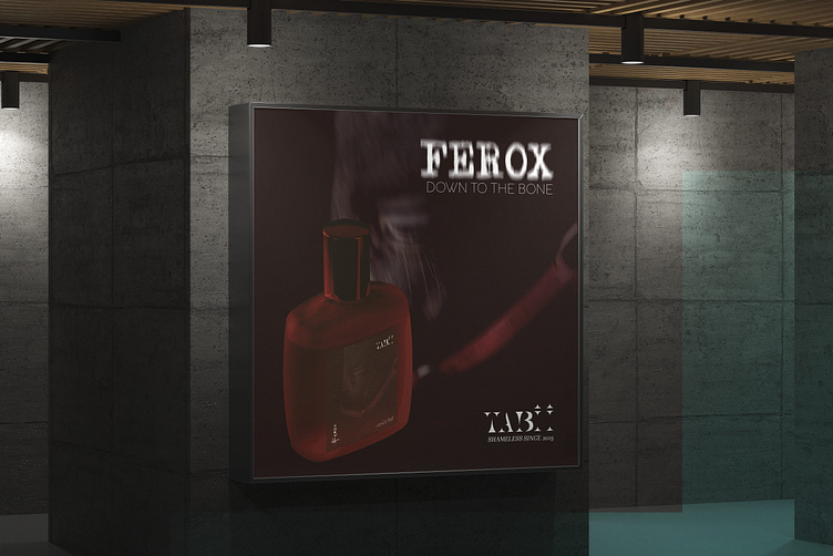


The commercials for each scent further demonstrate the creative direction for the brand creation process, and what emotions, elements, and lifestyle each scent is supposed to represent.
No perfume buying experience is complete without the last finishing touches, namely the gift bag and other accompanying details. Each bottle of Taboo perfume is wrapped with decorative branded tape and placed in a beautiful paper bag.


Mockup sources
Magazine from Unblast
Logo from Unblast
Perfume bottle from Designbolts
Perfume box from Unblast
Billboard from Creative Market
Tape from Creatroom
Shopping bag from Unblast
All photography and video clips are from Pexels
All music is from Pixabay
