Crust&Crème pastry shop

Crust & Crème is a fictional pastry shop visual identity created based on brief 122 from @briefclub. My idea was simple lines, bold colors and a pinch of magic! I started with crafting a unique, immediately recognizable logotype and logomark.

Each element of the logomark has its meaning. The letter "C" stands for "crust" and "crème". The graphical elements (swirl, zig-zag and star) are symbolic representations of, respectively, cream, pie crust and quality. The resulting logomark resembles a croissant or a cupcake while the full logomark is more than just the name spelled out in a font.

The brand pattern was created with simple illustrations of various pastries, completed with the brand's signature star graphic. The Crust & Crème color palette is made up of pink, orange, purple and beige, colors that bring to mind juicy fruit, crispy crust, and scrumptious pastry cream.
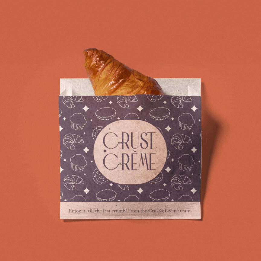
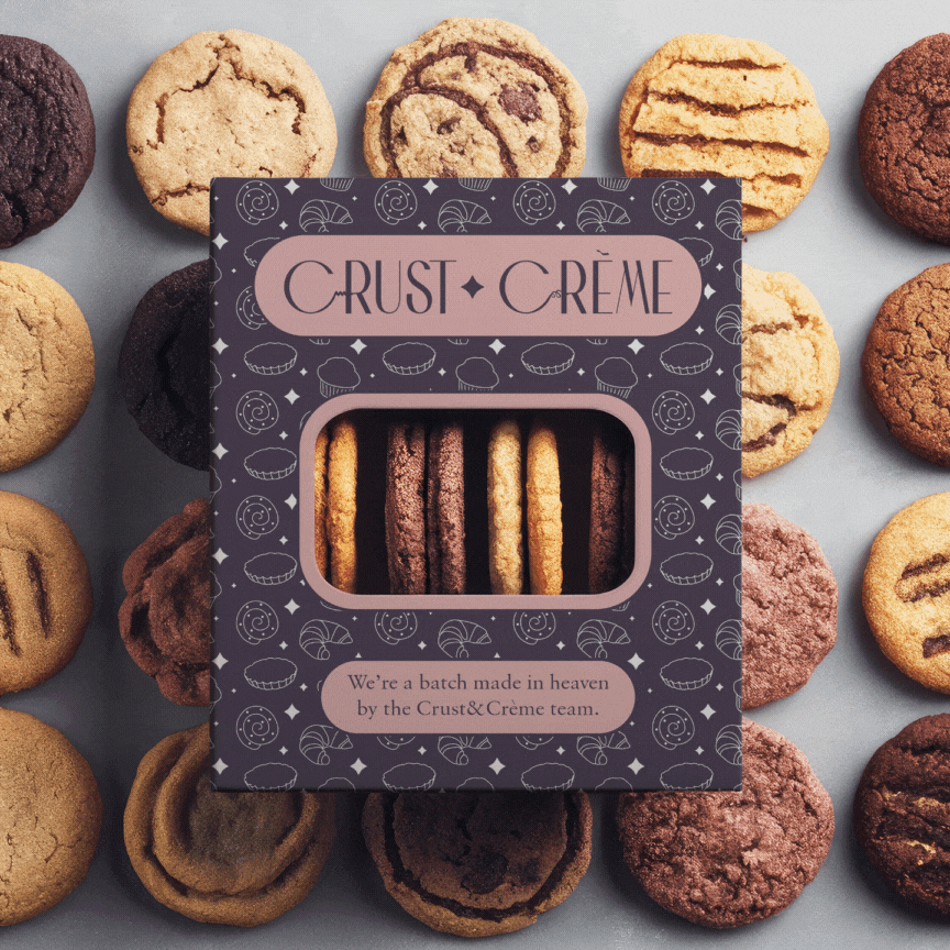


While offering a bold and modern color palette, Crust & Crème also has a certain rustic and vintage feel to it thanks to the swirly lines and thin, curvy font. The minimalistic packaging evokes feelings of homemade baked goods and the personalized joyful coffee cups brighten up the clients' day.


Crust & Crème's social media presence reflects its vibrant and joyful visual identity. The used photography is carefully selected to fit into the brand color scheme and the rustic but minimalistic personality. The content encourages audience participation and contribution, helping the pastry store increase customer loyalty and brand recognition.


Mockup sources:
Storefront from MrMockup
Box with tape from MrMockup
Pastry bag from Unblast
Cookie box from Mockup Cloud
Cake packaging from New Mockup Today
Menu from MrMockup
Icecream cup from New Mockup Today
Standing boxes from MrMockup
Paper cups from MrMockup
IG profile packe from Unblast
IG stories from Graphiclist
