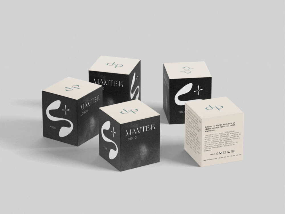
Mante·K body butter
Mante·K is a luxurious twist on Mercadona's ManteK body butter from the Deliplus line of cosmetics. I decided to give the packaging and the brand itself a more elegant and sophisticated look. To give the product a fully refreshed look, I redesigned the Deliplus logotype to make it more whimsical and unique.
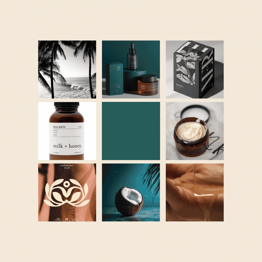
To be able to fully present the updated brand's potential, I added some more scents to the Mante·K line. Apart from coconut, there is mango, avocado, coffee and berries.


Each scent has its dedicated color to be used on the labels and minimalistic black and white images of the respective plant for the box. These moodboards created for each scent illustrate each color scheme and the inspiration for the brand's look.
The resulting new packaging is classy, minimalistic and easily identifiable. The used fonts and color combinations convey Mante·K's spirit as a cosmetic line: simple but deeply nourishing formulas and a philosophy of sustainability and love for nature.

Furthermore, the original plastic packaging is replaced with a refillable weck jar and a box made of recycled paper. This new approach to packaging goes in line with Mante·K's commitment to not only nourish the soul and skin, but also contribute to restoring balance in the environment.