🎯 Project: Energy HSE Summit 2025 – Landing Page Design

🛠️ Tools Used:
Figma · Material 3 Design System · Unsplash · Custom Illustration
🧩 Overview
Energy HSE Summit 2025 is a global industry event hosted in Bahrain, bringing together health, safety, and environmental leaders from across the energy sector. My goal was to design a modern, responsive, and conversion-optimized landing page to promote the event and drive registrations.
The design captures both the technical professionalism and forward-thinking sustainability of the summit through layout, visuals, and typography.
🔍 Goals & Objectives
Highlight key event information at a glance
Drive registration with strong CTAs
Showcase speakers, topics, and credibility
Provide an intuitive and responsive UX
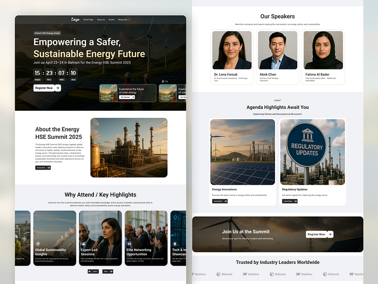
🖥️ Desktop Layout Highlights
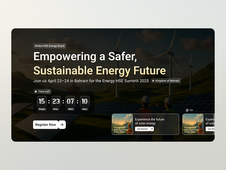
🎬 Hero Section
A bold, cinematic background image sets the tone for energy and innovation
Countdown timer and call-to-action ("Register Now") reinforce urgency
Carousel content teaser gives users a glimpse into the summit's theme

🏭 About the Summit
A side-by-side block with rich visual context and a short mission-driven paragraph
Designed to immediately explain the value of attending

💡 Why Attend / Key Highlights
Scannable horizontal card layout showing 4 key takeaways
Each feature supported by custom images and meaningful headlines

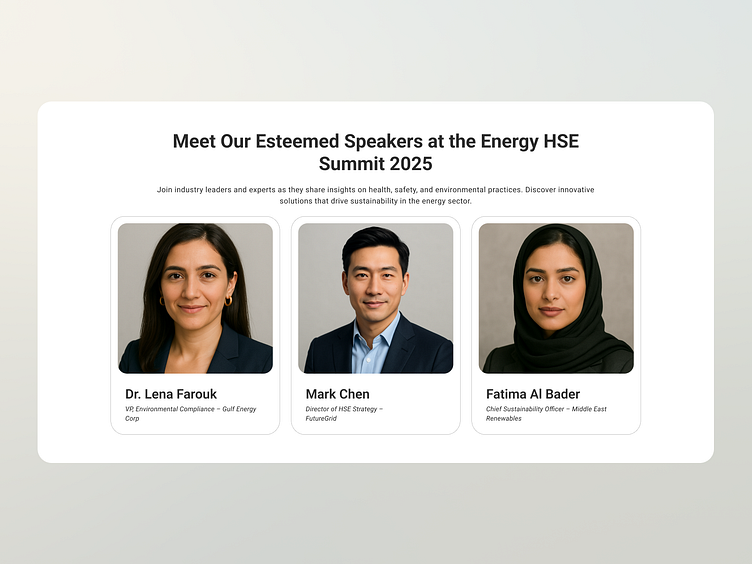
🎤 Featured Speakers
Three structured cards presenting speaker headshots, names, and titles
Layout adapts smoothly for mobile and desktop
Headshots cropped, centered, and styled in Material 3 component cards
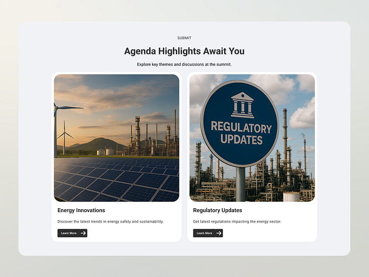
📆 Agenda Snapshot
Cards showing preview sessions like “Energy Innovations” and “Regulatory Updates”
Helps communicate topics without needing a full agenda breakdown

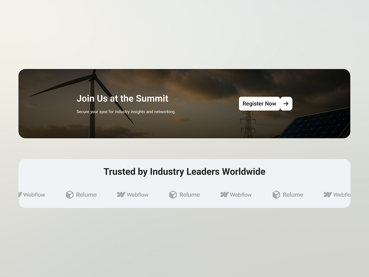
🚀 CTA Banner – Join Us at the Summit
Prominent full-width banner with a clean button
Encourages users to take action with a clear value proposition

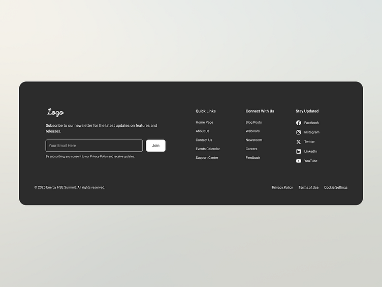
🔚 Footer
Full responsive footer with quick links, contact, and social platforms
Newsletter sign-up component for ongoing engagement
📱 Mobile & Tablet Views
Components resized and restructured for touch-optimized interaction
Sections stack vertically while maintaining rhythm and accessibility
Menu collapses to a hamburger icon for clean navigation
📸 Mockups attached: Desktop · Tablet · Mobile · Clean UI blocks · Live preview screens

🎨 Visual Direction
Color palette: Deep navy, clean whites, safety green, warm amber
Fonts: Material 3 system (Roboto / Open Sans)
Icons: Material Design icons & simple custom SVGs
Imagery: High-resolution, industry-relevant (solar, safety, smart grids, compliance)
🧠 UX Considerations
Clear visual hierarchy for fast scanning
Strong color contrast and button sizing for accessibility (WCAG friendly)
Modular component design for future content expansion
🗣️ Final Thoughts
Designing this project gave me the opportunity to blend user-first UX principles with the precision and authority of the energy & HSE space. Every section was built to inform, inspire, and convert.
Thanks for scrolling through! Feedback is always welcome 👇
💬 Let me know what you think in the comments! 📥 DM if you're working on an energy, tech, or B2B event platform.
📸 Attachments for Dribbble Shot Layout:
1 cover image (main hero layout)
Full page scroll mockups (desktop/tablet/mobile)
Modular breakdown (individual sections: hero, speakers, agenda, footer)
Device mockups (laptop/tablet/phone)


Don't forget to follow me if you don't to miss other shots.
Please show a little bit of appreciation! & show some ❤ and follow me.
I'm available for the freelance project