Nopan – Visual Identity for a Fintech Platform

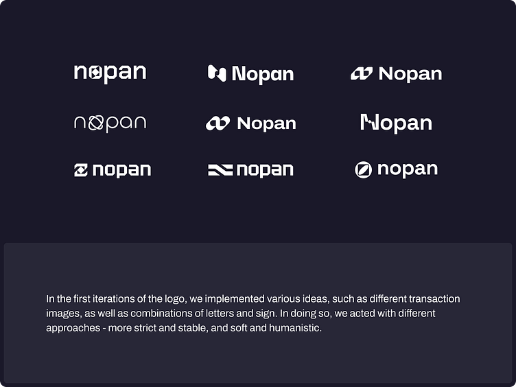
We collaborated with Nopan to create a bold and thoughtful logo that embodies their mission of simplifying and securing global digital payments. Our aim was to create a visual identity that communicates trust, structure, and innovation, which are all fundamental aspects of the brand's identity.
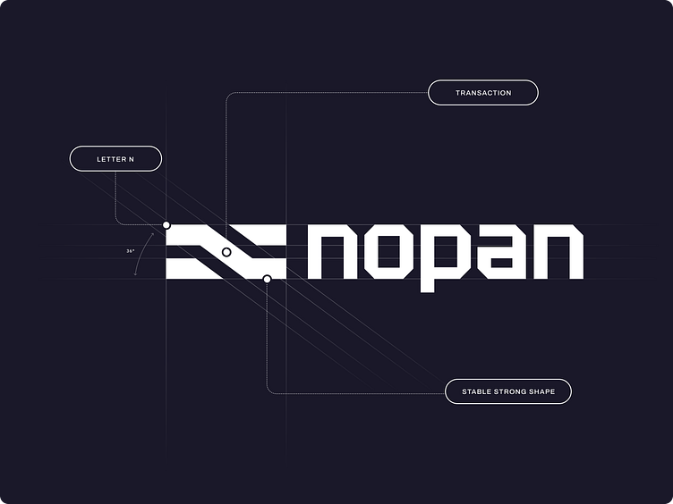
The symbol is built on a strong rectangular frame that speaks to reliability and precision. Within it, a system of clean, angular lines subtly forms the letter “N” while representing the seamless flow of digital transactions. The accompanying custom wordmark echoes these geometric cuts, ensuring consistency and balance across the entire system.
Designed for versatility, the identity scales effortlessly across mobile apps, dashboards, and physical touchpoints. With clear rules for spacing, alignment, and color, the result is a cohesive brand system that stands out in the fintech space, being confident, modern, and built for global reach.