Brand Identity Update / Real Estate Developer

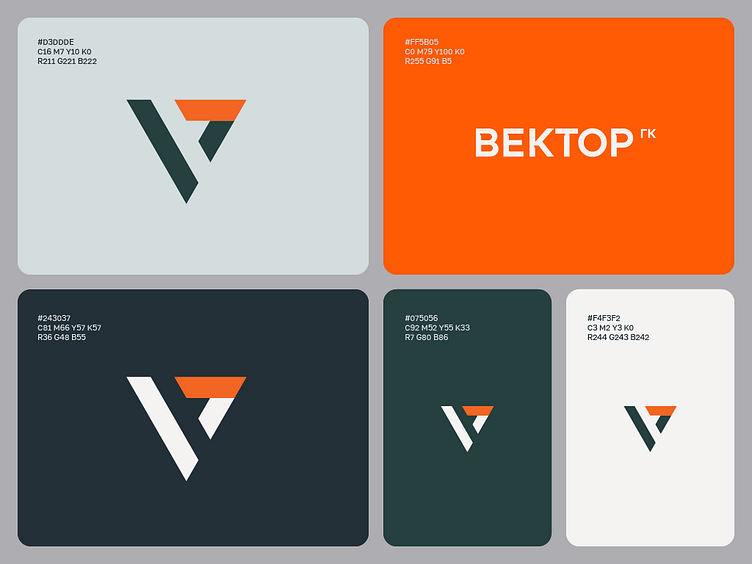
This case focuses on refining the logo design for a real estate development company. The company primarily specializes in the construction of residential high-rise buildings and housing complexes. In the initial version of the logo, the typography of the name had not been fully developed. I created an original font with selective triangular cutouts in the letters, echoing the triangular shape of the logo symbol. During the design process, it was also decided to shorten part of the name into an abbreviation and place it as a superscript following the main name. The corporate color palette was updated, with additional shades introduced to match the brand's tone. Finally, a sample billboard layout was created for the brand’s advertising campaign.