CareOps Brand Guidelines

CareOps Story
CareOps Solutions was founded with a singular vision—to revolutionize diabetes management through innovative technology. Their journey began when they recognized the challenges faced by healthcare professionals in providing optimal insulin therapy. From complex patient data to the risk of adverse outcomes like hypoglycemia and hyperglycemia, they saw an opportunity to simplify and enhance care through precision.

The CareOps voice is a reflection of its identity. The way CareOps communicates — through writing and speech across all media — is as important as its visual presentation. The words chosen and the manner in which they are used help shape and strengthen the CareOps brand.

Colors are a primary defining element of the CareOps brand. They play a crucial role in shaping the emotions and perceptions of the audience. CareOps stands for honesty, thoughtfulness, compassion, and responsibility — values that are reflected through its brand colors.


Illustration and icons are powerful communication tools, but only if you have something to say. Ensure that the illustrations compliment the messaging wherever used - otherwise, this can be omitted.

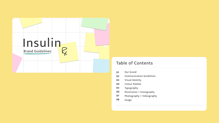
This brand book showcases all aspects of InsulinRX, providing a comprehensive view of its identity. It also includes links to all brand assets in various color variations and formats.
