CyberNest - LOGO DESIGN

Logo Brief
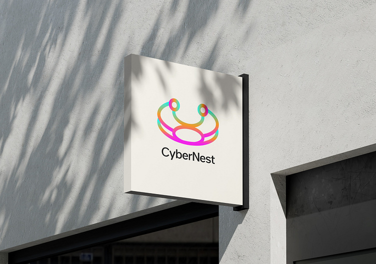
Brand Name: CyberNest
Industry: Technology, networking, digital innovation.
Brand Personality: Modern, inclusive, futuristic, dynamic, and connected
Design Concept & Process
Inspiration & Ideation:
The design by connectivity, community, and digital evolution.
The abstract crown symbolize leadership or excellence in the digital space. The logo has a circular symmetry, representing unity, balance, and connection elements often associated with networks or digital platforms.

Development
The central icon features a rounded, looped structure resemble both a nest and a crown connecting the brand name with a sense of innovation and prestige.The use of circular nodes and arcs reinforces the theme of interconnectivity and technology.
Typography
Font Used: A clean, sans-serif typeface.
Style: Modern and minimal.
Character Spacing: Slightly spaced for readability.
Case: Mixed case with capital “C” and “N” to maintain brand readability while adding a professional tone.
Impression: Tech-forward, accessible, and trustworthy.


Color Palette
The logo uses a vibrant, multi-color gradient transitioning through:
Magenta/Fuchsia– Creativity, energy
Orange– Enthusiasm, innovation
Yellow– Optimism, clarity
Green/Cyan– Growth, technology
Blue– Trust, stability
The color palette aligns with tech startups or creative companies, giving a lively, futuristic, and inclusive feel. The spectrum suggests diversity and adaptability, which can represent a wide range of services or a broad community.

Outcome & Impact
The final logo design CyberNest as a vibrant, modern tech brand that’s grounded in connection, inclusivity, and innovation. The versatile and dynamic icon can easily scale for various uses (app icons, print, web, embroidery).The color gradient and minimal typography pair well to create a strong visual identity that’s both memorable and futuristic.

