Why should I make this "CARD"?
Hi everyone!
Hope you're all doing well 🙌 This week, I want to share a design exploration I’ve been working on, it’s a redesign of the product card from Alodokter. This is actually a continuation of my previous post, so thanks for sticking with me 😄
Just a heads-up, this is purely based on my personal perspective and learnings so far. I’d really appreciate any feedback or input you might have! Also, I’m totally open to collaborating or learning together, feel free to reach out if you’re interested in doing a project or just want to grow together ✅

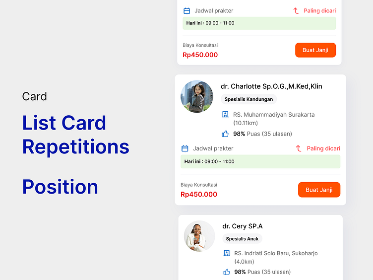
The goal of this product card redesign is to emphasize and surface the most important information for users. Here’s a breakdown of the key changes and the rationale behind them:
- Highlighting the specialist — I turned the specialty into a chip and positioned it at the top of the card. This ensures that users can immediately identify what kind of specialist the doctor is without having to search for it.
- Refining user reviews — I noticed a significant gap between the number of bookings and the number of reviews, which could potentially confuse users. To address this, I decided to simplify the display by only showing the percentage of user satisfaction based on those who provided a rating. This gives users a clearer, more trustworthy metric.
- Improving schedule visibility — While reviewing the schedule section, I realized most doctors are only available once per day. I questioned whether some might be available at multiple times. If so, I designed the schedule using chips to display all available time slots, making it easier for users to scan and choose.
- Simplifying the pricing label — I removed the “Biaya Konsultasi” label to keep the layout cleaner and reduce visual noise. I believe most users are already aware that the price shown refers to the consultation fee, so the label was redundant.

I noticed that after Alodokter updated their UI card, the layout feels less crowded, especially with the removal of the distance info between the user and the hospital. That’s a good move! But it got me thinking: can we make the information even easier to scan when users are browsing through the full list?
So I decided to explore that idea a bit more and compare it with other apps. And yes, I know most of the products I’m using as comparisons are marketplaces, but hear me out. If you look closely, there’s a reason behind how and where they place certain elements. It’s all about hierarchy and helping users find what matters most, quickly.


I improved this design by making small adjustments based on references from other products as well as core UX principles. Initially, I placed the label at the top aligned with the “Specialist” chip, similar to how discounts are displayed on Tokopedia. However, I realized this might cause confusion due to the similarity in behavior and visual patterns. Then, I tried placing the label near the total review section, aiming to group it with related information. This grouping helps users better understand the context while reading. In another iteration, I aligned the label with the main information area, applying the principle of repetition to make the content easier to scan. I also decided to reduce visual emphasis by replacing the block style chip with a simpler red label.
Finally, for the chosen design, I moved the label to the same level as “Jadwal Praktek.” This decision was influenced by the serial position effect, aiming to create a subtle visual break when users scan the content. I also increased the emphasis on total reviews and added more clarity to the pricing and schedule information.
So what about you? please write it at comment, feel excited to hear it from you 😊👋