SALT & LIGHT MINISTRIES – Brand Identity

✨ SALT & LIGHT MINISTRIES is a vibrant faith-based organization focused on illuminating lives and spreading hope. Their mission is simple yet powerful — to be the salt of the earth and light of the world.
Our collaboration aimed to create a striking visual identity that captures the essence of their purpose while remaining accessible and memorable. The result is a brand system rooted in clarity, warmth, and modern faith-driven design.


🔹 What We Created:
✝️ Logo Design – A minimal, cross-inspired symbol with dynamic flow, representing guidance and spiritual clarity.
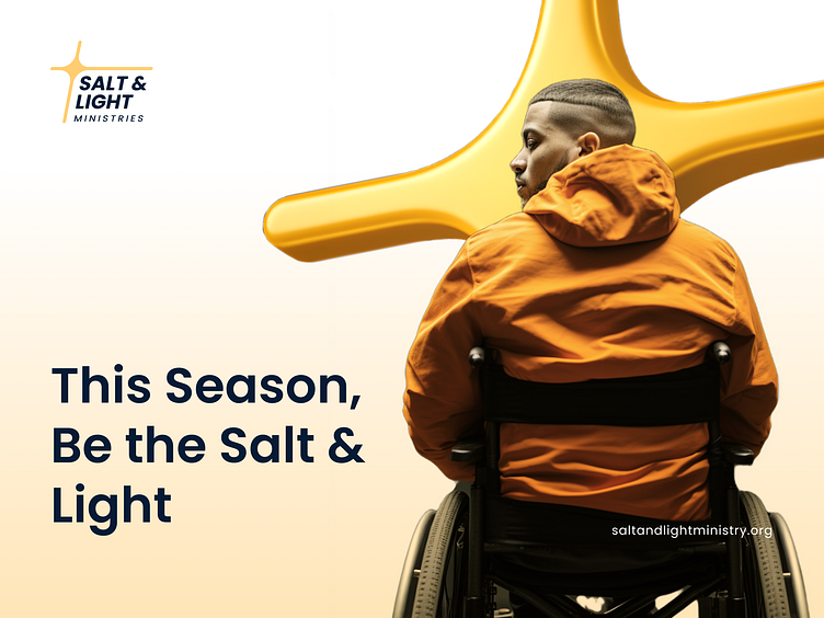
🎨 Brand Color Palette – Deep navy paired with radiant gold and crisp white to symbolize wisdom, purity, and divine light.
📱 Mobile App Poster – Designed for digital and physical environments, this promotional piece invites users to “Join the Movement of Light” — bold typography, a QR code for app access, and a flowing golden element make it stand out in any setting.
🧱 Design Thinking:
The identity leans into spiritual symbolism with a contemporary design language. The flowing curves in the poster art are inspired by the movement of light and grace. The font choices are clean and legible, aiming to resonate with both digital-native and traditional audiences.
🧡 Project Highlights:
Ultra-realistic outdoor mockups
Poster variations with modern, editorial layouts
Brand system optimized for print, web, and mobile
👀 More Coming Soon Stay tuned for the full brand guide, app interface design, and rollout materials.
Tools Used:
Figma / Photoshop / Illustrator / AI-assisted Mockup Rendering
