KanBir Solutions – Brand Identity Design
KanBir Solutions is a forward-thinking business consultancy offering a hybrid of strategic financial advisory and next-gen ERP integration. I developed a bold, minimal brand identity that reflects their dual expertise and honors the company’s deeply personal roots.
Derived from the founder’s children—Kanshi and Kabir—the name KanBir symbolizes both legacy and a progressive vision. This emotional foundation shaped a visual system that bridges tradition with innovation.
The monogram, inspired by Japanese hanko stamps, features a continuous line forming the letter “K” within a square—symbolizing the company’s all-in-one solution model. The diagonal strokes serve a dual purpose: resembling a forward-facing arrow to reflect innovation, and an open book to subtly represent financial services and transparency.
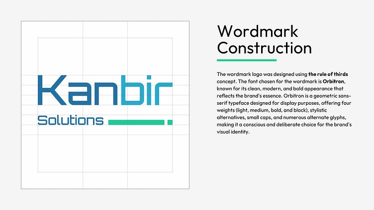
The wordmark, set in Orbitron, brings a structured, tech-forward personality to the identity. Complemented by the Outfit typeface, the system strikes a clean balance between boldness and approachability.
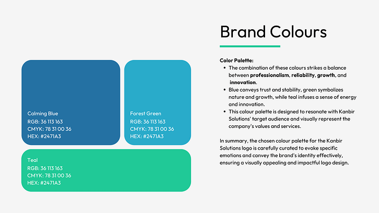
The color palette—a curated mix of deep blue, green, and teal—communicates trust, growth, and innovation. These tones were selected to resonate with the firm’s clientele while visually aligning with its core values of transformation and reliability.
This identity system is more than a logo—it’s a design narrative that communicates purpose, clarity, and confidence.