Celestique – Skincare Landing Page Design
About Celestique
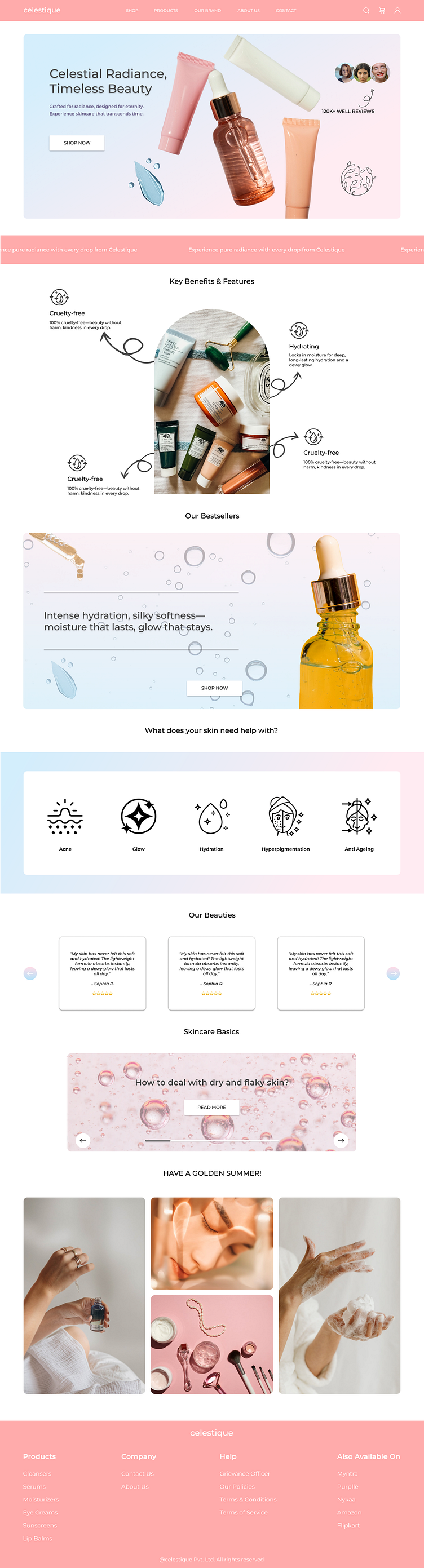
A clean and modern landing page for a skincare brand — designed with a soft, calming colour palette to evoke trust and purity. Focused on showcasing product benefits and driving conversion with a minimal and intuitive layout.
Design Approach
For Celestique, I designed a clean and calming landing page that aligns with the soothing feel of a skincare brand. Soft pastel colors and thoughtful spacing create a gentle user experience. I incorporated dedicated blog sections and detailed brand storytelling to build trust, educate users, and strengthen the brand’s presence—all while keeping the layout minimal and easy to navigate.
What I Learned
This project helped me understand the importance of translating a brand's essence into visual design. I learned how subtle choices in typography, color, and content layout can build trust and reflect a skincare brand’s calm, clean identity. It also pushed me to explore the impact of detailed storytelling and informative blog integration in improving user engagement.
About Me
Hey there! I’m a budding UI/UX designer who’s obsessed with clean layouts, aesthetic color palettes, and making pixels feel like poetry. ✨
“Celestique” is one of my recent passion projects — a calm and minimal skincare landing page crafted to highlight beauty with simplicity. I love blending visual storytelling with functionality, and this one was all about balance, clarity, and a smooth user experience.
Always up for a good design convo and open to feedback — drop by and say hi! 💬
