OmidTech

Hi everyone, I hope you're doing well.
I’d like to briefly present the design project I recently completed for OmidTech. The task was to design a banking application, and I worked on it in both Light and Dark modes, creating a comprehensive design system, logo, and intro animation. In total, I designed over 20 screens, covering the main flows of the app.
🔹 Tasks & Deliverables
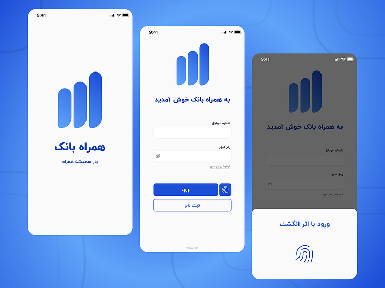
1. Login & Registration Page
Includes phone number, password fields, login button, and a "forgot password" link
Focused on simplicity, accessibility, and user-friendliness
2. Banking Dashboard
Displays account balance, recent transactions, and options for money transfer, bill payment, and card-to-card transfer
Designed with a clean, minimal UI and proper UX principles
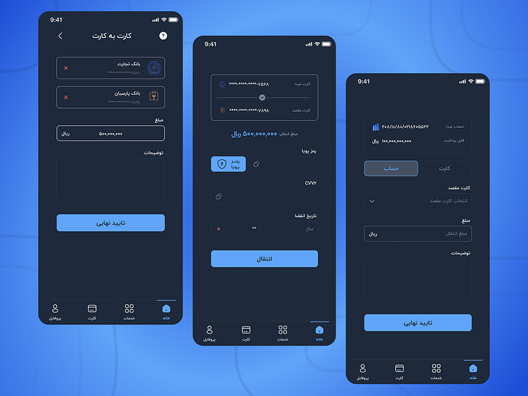
3. Money Transfer Flow
Covers selecting the source account, entering the destination card number, amount, description, and final confirmation
Designed for clarity, security, and minimizing user error
4. UI Components Based on Design System
Input fields for card numbers and amounts
Includes all states: default, active, disabled, and error
Reusable and scalable across the design system
5. Dark Mode Design
Applied to pages like dashboard and transfer
Focused on contrast, readability, and visual consistency
🔹 Design Considerations & Challenges
In task 3, where bank-to-bank transfers were requested, the scenario included both account selection and card number entry, which can vary significantly depending on the banking app. I explored different real-world patterns and designed a flexible solution that accommodates various use cases.
Throughout the process, I aimed to integrate all exercises into a cohesive application, rather than designing isolated pages. This holistic approach allowed me to build a more realistic and benchmark-driven design.
For instance, while some apps (used by specific banks) limit transfers to in-bank accounts, general-purpose apps like App, Top, or Jiring offer more flexibility. I designed the app accordingly, allowing multiple cards/accounts as the source.
For the design system, I selected the color palette for both Light and Dark modes using a combination of AI-assisted tools and manual contrast testing to ensure optimal readability and aesthetic balance.
As for the information architecture, I prioritized fulfilling the exercises’ requirements while maintaining a clean and user-centric structure. For example, although the dashboard was required to show transfer, bill payment, and card-to-card actions together, I separated some actions into dedicated tabs in the bottom navigation for better usability. Additionally, features like "Add Card" and "Card to Card Transfer" are accessible through the “Cards” section as well.
In summary, while I could have taken a more minimal approach to the information architecture, I chose to follow the exact brief requirements and prioritize a professional and user-friendly structure.