JAR. – Personal Brand Identity for Jhye Richardson

Introduction
JAR. is the personal brand for Australian cricket player Jhye Richardson, a fast bowler known for his energy, speed, and rising reputation on the international stage. This identity project aims to encapsulate his passion for performance, unique personality, and strong connection with fans. The result is a bold and scalable logo system, paired with a minimalist website and custom visual assets that amplify his presence across both digital and physical platforms.
The Goal
The objective was to develop a personal brand that feels professional yet relatable, powerful yet modern. The visual identity needed to:
- Represent Jhye’s performance-driven career and individuality.
- Translate well across merchandise, digital media, and sponsorship activations.
- Support future brand expansion, including social content, product drops, and promotional partnerships.

The Challenge
- Name Complexity: “Jhye Richardson” isn’t easy to recall or spell at a glance. A simplified, impactful acronym was required — hence “JAR.”
- Balancing Personality & Performance: The identity had to reflect both the athlete’s energetic playing style and off-field charisma without leaning into generic sports aesthetics.
- Scalability & Application: The system needed to work on large-scale formats (posters, apparel) as well as small-scale digital touchpoints (profile icons, favicons).
Design Direction
The brand direction combines grit, clarity, and motion, reflecting the core attributes of a fast bowler.
Typography-first identity: The acronym JAR is treated as a monogram and a statement. Strong sans-serif fonts like Wotfard and Silk Mono were chosen to balance athleticism with modernism.
Color palette:
Frosted Glass (E8EAF0) – minimal and grounded
Scorchers Orange (F54F01) – energetic and personal, nodding to Jhye’s BBL team
Night (1A1A1A) – serious and focused tone for digital applications
Moodboard Influence: Inspiration was drawn from contemporary sports brands (Nike, CR7), modern fashion, and IPL team aesthetics, as seen in the brand board.
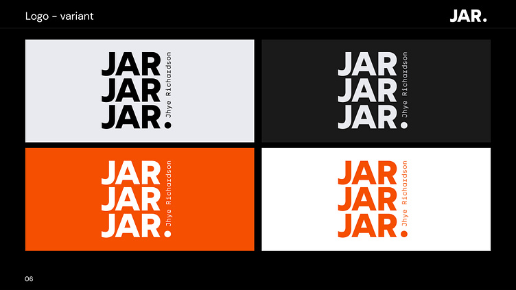
Logo Construction
The logo is built on a clean modular grid, enabling multiple variations:
Vertical stack with emphasis on the “JAR” sequence.
Variants with full name “Jhye Richardson” for formal applications.
Flexible usage across light, dark, and accent backgrounds.
Monogram lockup designed for merchandise, social avatars, and branded packaging.
Type exploration included circular, stacked, and typographic lockups to explore tone — with final selection being bold, upright, and vertically aligned for a strong presence.


The Result
The final identity system for JAR. is a dynamic, high-contrast visual brand that balances professional polish with personal edge. The design has been applied across:
Apparel and merchandise (shirts, caps, bags)
Custom cricket equipment
Business cards and athlete kits
A minimalist, high-performance personal website
The brand positions Jhye Richardson not just as a promising athlete, but as a marketable personal brand ready for modern endorsements, fan engagement, and media growth.
