E- Commerce App
Shopping App – Reinventing Local E-commerce in Bahrain
Overview
Kishk isn’t just another shopping app. It’s a celebration of Bahraini culture, local vendors, and personalized shopping. Built to showcase both the biggest names and the hidden gems in Bahrain’s retail scene, Kishk gives users access to everything—from boutique fashion to household items—all from the comfort of their phones.
My role as a UI/UX designer was to bring structure and soul to this experience—making shopping intuitive, reliable, and uniquely local.
The Spark: Why this app Needed to Exist
In Bahrain, Vendors—especially small businesses—lack the tools to offer seamless online experiences. Issues like poor sizing guidance, inconsistent deliveries, and cluttered product displays created friction on both sides.
App aimed to fix all of that with one goal: make local shopping easier, smarter, and more connected.
Design Challenges We Tackled
• Local discovery: How can users find amazing local products they didn’t even know existed?
• Custom shopping: People want clothes that fit—without guessing their size from a chart.
• Delivery trust: Could we ensure buyers felt confident their orders would arrive on time and in good shape?
• Simple navigation: The platform had to work for everyone—tech-savvy users and traditional shoppers alike.
What We Designed & Why It Worked
1. Personalized Sizing Built In
Instead of asking users to guess sizes, App lets them submit exact measurements where needed. This feature, front and center on relevant product pages, made shopping for tailored items feel as easy as adding to cart.
2. Vendor Visibility with a Human Touch
Each vendor got a dedicated mini-storefront within the app. With branding, reviews, and popular items highlighted, users could shop confidently while feeling connected to the sellers behind the scenes.
3. A Clean, Guided Experience
We ditched the clutter and built a clean, card-based layout with curated categories, trending products, and smooth transitions. Navigation stayed consistent throughout, with filters that didn’t overwhelm and search that just worked.
4. Delivery with Confidence
A major concern for users was reliability. We embedded delivery tracking, clear estimated arrival times, and support touchpoints directly in the post-checkout flow. The App team managed deliveries in-house, which we emphasized in the UX to build trust.
Design Approach
1. Wireframes That Prioritized Simplicity
I started with low-fidelity wireframes to map out flows for browsing, product filtering, size selection, cart, and checkout. The focus was on reducing cognitive load—each screen had one primary action, with minimal distractions.
We iterated quickly, testing flow logic with mock data before moving to visual design.
2. Visual Language: Rooted in Bahraini Identity
App’a brand colors—warm neutrals and rich accents—guided the entire visual design. I leaned into:
• Minimalist UI: Clear sections, bold CTA buttons, lots of white space
• Readable typography: Arabic and English friendly, clean sans-serif fonts
• Soft iconography: Friendly, rounded icons to make navigation more inviting
• Consistent color hierarchy: Reinforced trust with clear visual cues for actions, success, and confirmation states
These visual choices helped the app feel modern while still respecting the cultural tone.
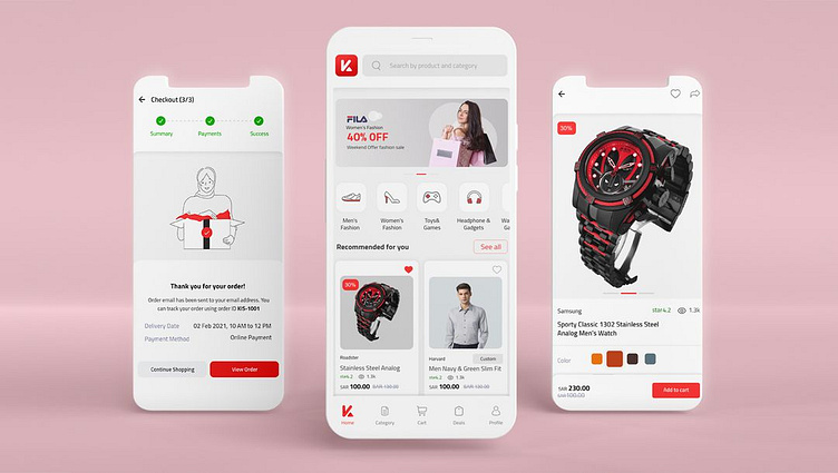
3. Key Screens Designed & Prototyped
• Home: Curated vendor highlights, trending products, and search up top
• Product Detail: Size customization built right into the selection flow
• Vendor Profiles: Store branding, top products, and customer reviews
• Checkout Flow: Streamlined into 3 steps with delivery confirmation upfront
• Order Tracking: Real-time status with clear timestamps and support access
All high-fidelity prototypes were created in Adobe XD, ensuring pixel-perfect handoff to development.
Usability Testing & Feedback
We ran usability sessions with a mix of experienced and first-time online shoppers. Insights that shaped the design included:
• Users appreciated seeing local vendor names upfront
• Many wanted Arabic language toggle easily accessible (we added it in settings and welcome screen)
• We reduced checkout steps after users found the original flow too long
• Improved filter UX for mobile users based on swipe behavior and common habits
Results & Wins
• Faster shopping decisions thanks to better categorization and layout
• Return rate dropped due to clearer sizing and vendor transparency
• Increased user retention driven by smooth delivery and order tracking
• Positive vendor feedback, saying they felt “represented” on the app for the first time
Final Thoughts
This app isn’t just about buying things—it’s about discovering the best of what local Bahrain has to offer. By focusing on clarity, cultural relevance, and everyday convenience, the app became something users could trust and enjoy.
For me, this project was a reminder that great design isn’t about complexity—it’s about respecting the user, understanding the culture, and delivering simplicity with purpose.