Dripify – Brand Identity for a Sales Automation Platform

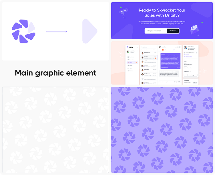
Our goal with Dripify was to create a visual identity that reflects the platform's core values: automation, technological advancement, and ease of use. We began with the logo — a clean, geometric symbol inspired by the idea of perpetual motion. This design symbolizes a continuous flow of sales and the automation that supports it, reinforcing Dripify’s role as a seamless growth tool for modern entrepreneurs.


The color palette centers around a confident purple, paired with neutral gray and white tones to maintain visual balance and accessibility across all touchpoints. Typography was carefully selected: rounded, soft forms give the brand a friendly, human feel while retaining a professional edge — perfect for a tool that blends technical power with user simplicity.

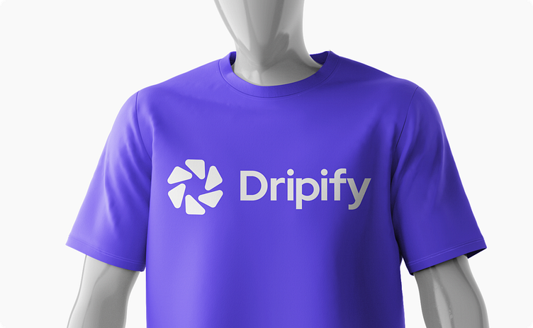
We designed the system to be fully scalable. The logo adapts across interfaces, from dashboards and browser tabs to business cards and branded merchandise. Every identity element is built to support usability, recognition, and long-term brand consistency. Through this design, we helped position Dripify as a smart, modern, and approachable platform ready to support business growth at every stage.