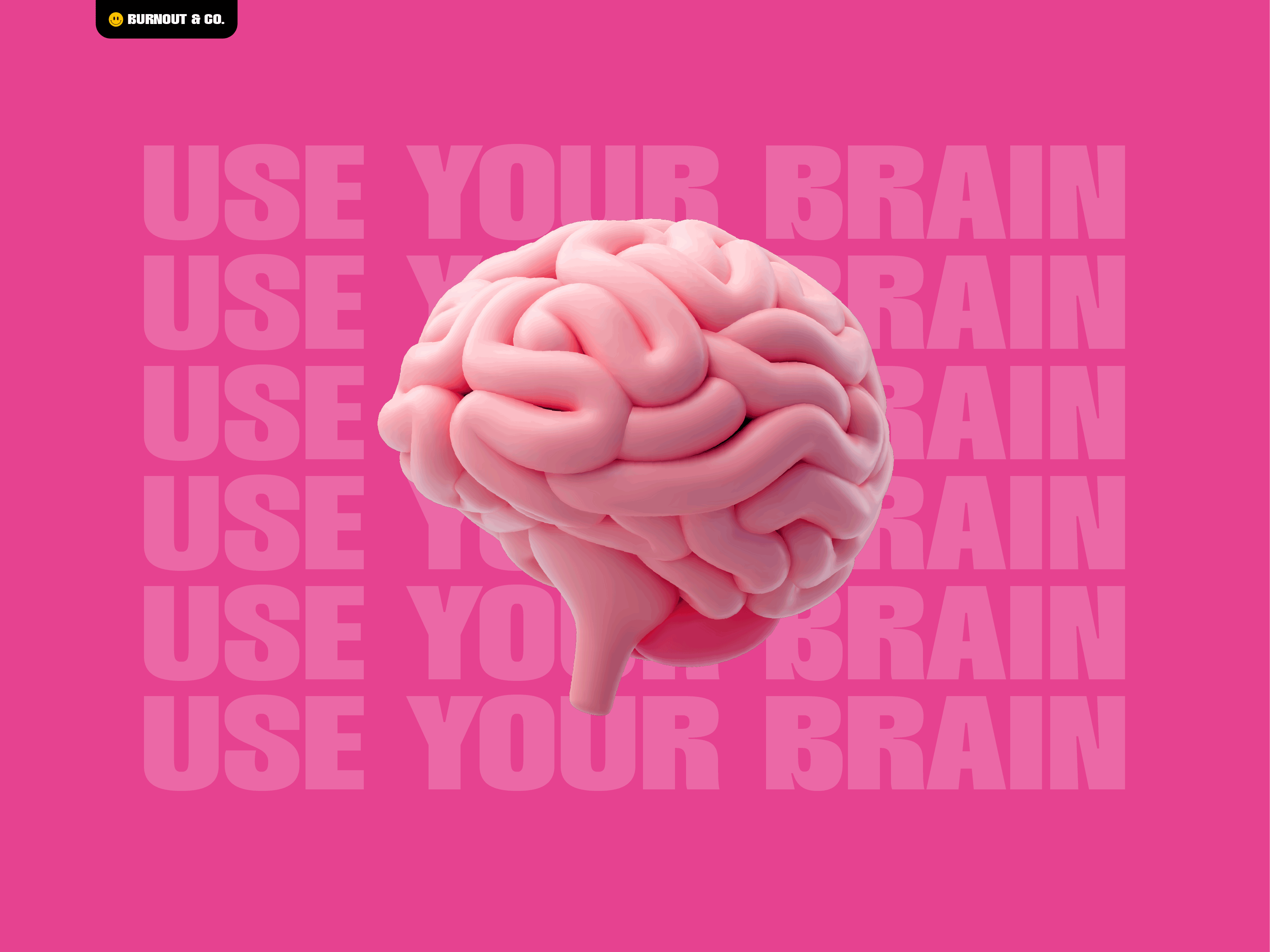
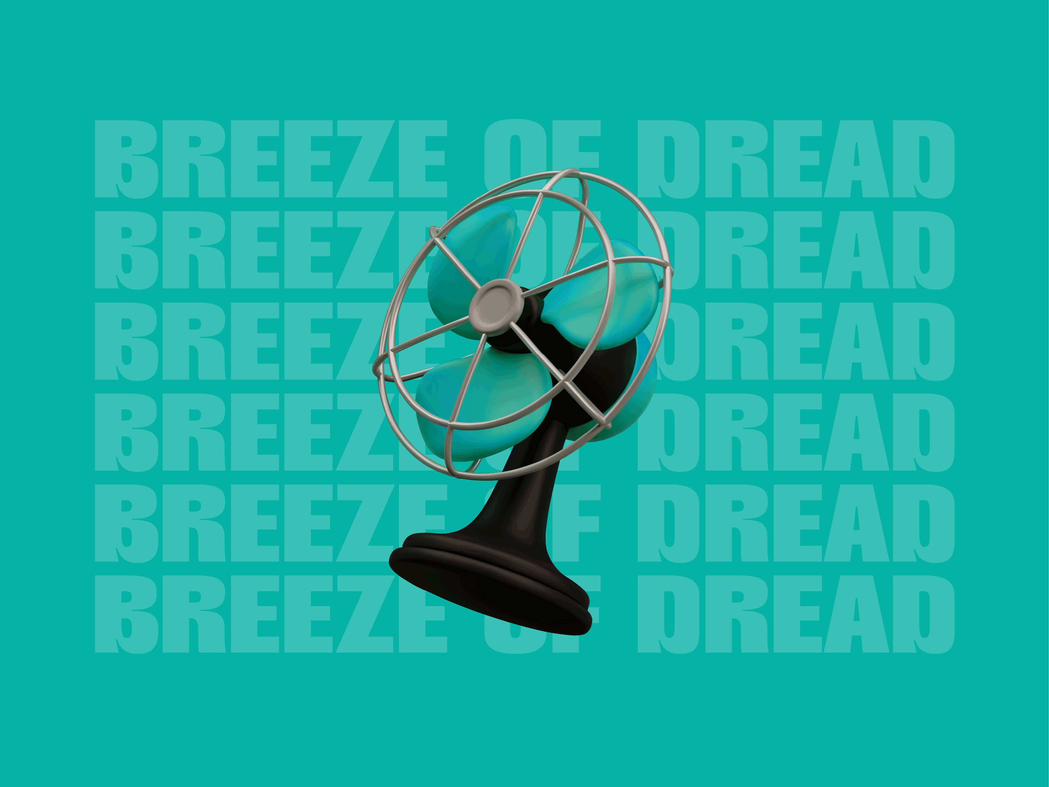
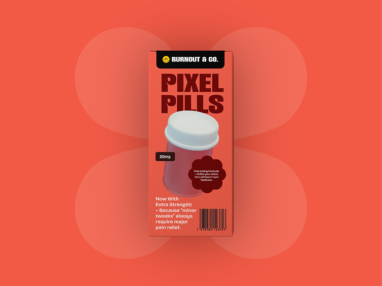
Burnout & Co.
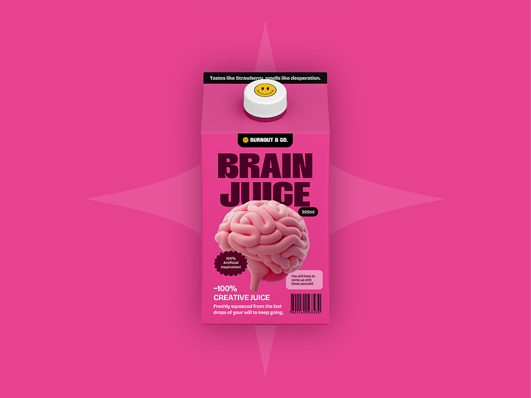
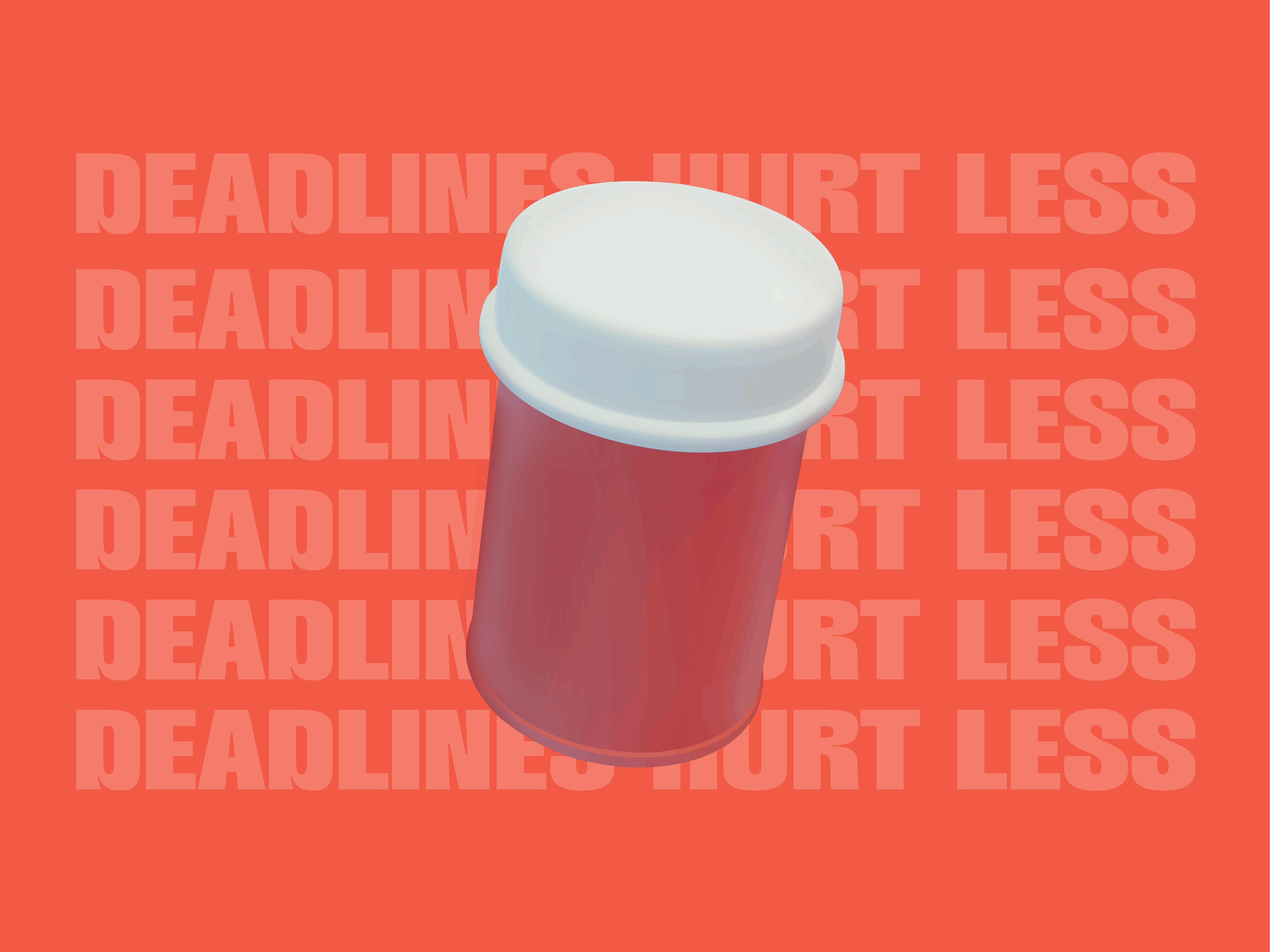
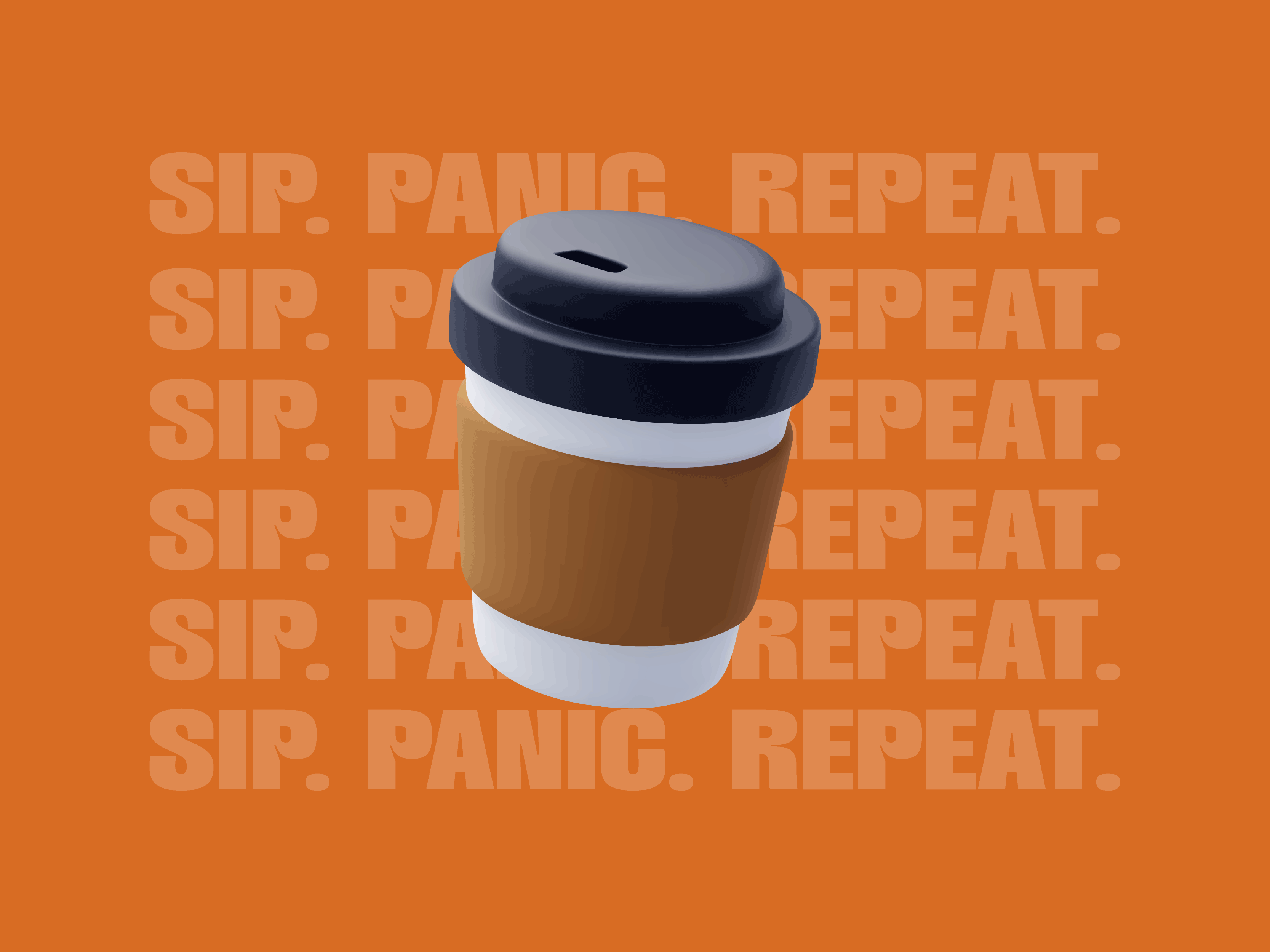
This conceptual packaging design project examines the often absurd realities of the creative industry—where tight deadlines, endless revisions, and shifting client expectations define the workflow. Through a satirical lens, this series of convenience store essentials reflects the designer’s lived experience, reframing everyday products as indispensable survival tools for navigating the chaos of the creative process. Each product playfully critiques the intersection of corporate inefficiency and designer burnout, where time lost to indecision, poor planning, and late-stage changes directly translates to missed revenue and personal exhaustion. The branding highlights the urgency of production timelines while infusing humor into the daily struggles of creative professionals.


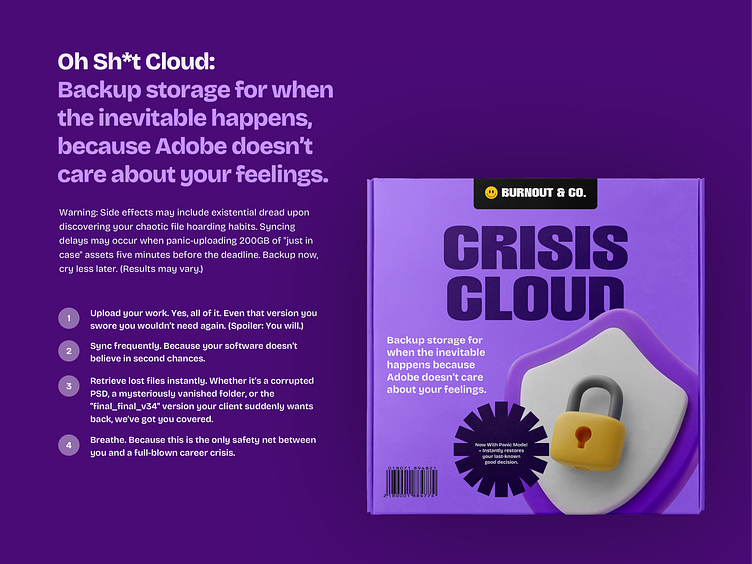


Enter your text here...This project required a combination of branding expertise, conceptual storytelling, and packaging design skills to bring the satire to life. Every detail—from the typography choices to the color palettes and ingredient lists—was crafted to reinforce the overarching theme of creative industry chaos.
The entire series is unified under a grocery store brand that plays on the concept of time pressure in design deliverables. Each product name, tagline, and packaging design integrates sharp, tongue-in-cheek copywriting to highlight the mental and physical toll of creative work. The brand narrative humorously acknowledges the designer’s reality—where time is money, and both are constantly in short supply.
