Packaging Design

Thought Process Behind the Design
The packaging design for the McSpicy Chicken box is bold and appetizing, intended to spark immediate hunger and excitement. The thought process behind this design centers around high-impact visibility and a fun, fast-food vibe. The black background provides a modern, premium contrast that allows the vivid elements—like the bright red and yellow typography, fries, and burger imagery—to pop dynamically.
These colors are not only associated with excitement and appetite stimulation but also echo classic fast-food branding cues. The outlined food doodles in a subtle goldish tone add a playful texture without overwhelming the central message, helping reinforce the product category (burgers, fries, drinks) while keeping the focus on the star item: the spicy chicken burger. Overall, the design strikes a balance between boldness and approachability, appealing strongly to younger, urban consumers craving flavorful, indulgent food.
Thought Process Behind the Design
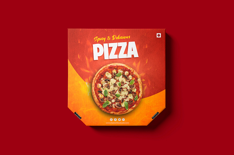
The pizza box design focuses on bold visual appeal and an instant sensory cue for spice and warmth. The primary colors—fiery red and vibrant orange—were chosen to evoke heat, flavor, and excitement, aligning perfectly with the “Spicy & Delicious” tagline. Red is a dominant color in food marketing because it stimulates appetite and creates a sense of urgency and indulgence, while orange adds warmth and a playful, energetic vibe. The gradient blend between the two creates a flame-like backdrop that emphasizes the hot, freshly baked essence of the pizza. Placing the pizza image at the center with toppings that include basil, mushrooms, and cheese makes the product look wholesome and mouthwatering. The large, bold white "PIZZA" text ensures immediate readability.
Thought Process Behind the Design
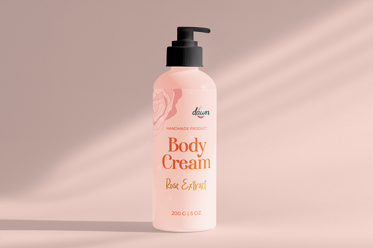
I designed the packaging for this body cream to embody the delicate essence of rose extract, which is why I incorporated a soft, hand-drawn rose illustration. The choice of a gentle pink color palette was intentional, symbolizing femininity, care, and the nurturing qualities women seek in skincare. I wanted the design to not only feel luxurious but also personal—highlighting that it's a handmade product crafted with thought and intention. The illustrated rose adds an artisanal touch, reinforcing the natural and intimate feel of the product. I aimed to create something that speaks to trust, softness, and the quiet beauty of self-care. Every element—from the tones to the textures—was chosen to connect emotionally with the user and elevate the unboxing experience into a moment of indulgence.
