Bookstore UI/UX Case Study: Seamless & Engaging Shopping

Finding the perfect book should be as enjoyable as reading one! "Shahreketab" is an online bookstore designed to create a smooth and engaging shopping experience for book lovers.
Problem/Solution
Many online bookstores have cluttered interfaces, making book discovery frustrating. This project focuses on user-centric design, ensuring that finding, browsing, and purchasing books is a seamless journey.
The idea for this project was inspired by the growing demand for a user-friendly online bookstore in Iran. Through competitive analysis and user research, I identified pain points in existing platforms and worked to enhance the overall book-buying experience.
Design Process
1.Research & Analysis
User research > Competitor analysis > persona development > user journey mapping
2.Ideation & UX Enhancement
User flow optimization > problem-solving > wireframing
3.Visual Design & Implementation
Typography selection > color palette > high-fidelity UI design
User Research
To create an engaging and accessible experience, I conducted research on user demographics, reading habits, and shopping behaviors. Understanding pain points allowed me to streamline the journey from book discovery to checkout.

Competitive Analysis
By examining top online bookstores, I identified strengths to incorporate and weaknesses to avoid—resulting in a refined and improved user experience.

User Personas
To create a personalized experience, I developed three user personas, each representing different reading behaviors and motivations. These personas guided the design decisions throughout the process.

User Journey Mapping
By mapping out the customer journey, I identified pain points and areas for improvement. This allowed me to remove obstacles and create a frictionless book-buying experience.

User Flow Design
I defined clear user paths to ensure intuitive navigation, making it easy for users to browse, search, and purchase books without frustration.

Ideation & UX Enhancements
Before wireframing, I analyzed usability issues in competitors’ websites and proposed solutions to enhance the user experience. These changes focused on improving accessibility, navigation, and overall usability.

Low-Fidelity Wireframes
I created structured wireframes to visualize the layout and functionality of key pages, focusing on hierarchy and usability. because of space constraints, I decided to show only a couple of the digital lo-fi wireframes that I designed.

Final UI Design
Selected an elegant typography & color palette to create a visually appealing experience.
Designed a clean and modern interface to improve readability and engagement.
Developed a style guide to ensure consistency across all pages
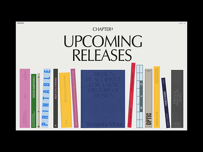
Homepage & Product Page – Desktop View

Category Page – Mobile & Desktop View

100% Mobile Responsive
What do you think?
I’d love to hear your thoughts on this UI/UX case study! Let’s discuss how thoughtful design can elevate online bookstores.