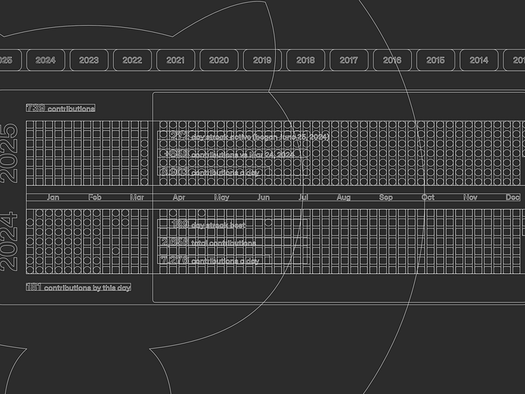
GitHub Year vs Year Contributions Concept

Closeup of a user interface concept of a GitHub contributions graph for 2025 above 2024 graph

For the final installment in my GitHub contributions concept series, I designed a year vs year view.

Maybe I’m just slinging more code these days, but I’d really like to easily visualize how my years stack up.

P.S. Figma outline view has me feeling like I’m designing Scantron sheets.

A user interface concept of a GitHub contributions graph for 2025 above 2024 graph
Figma outlines of a user interface concept of a GitHub contributions graph for 2025 above 2024 graph
Max Burnside
This is where I Dribbble.

More by Max Burnside

View profile
  • Services by Max Burnside

    View all services