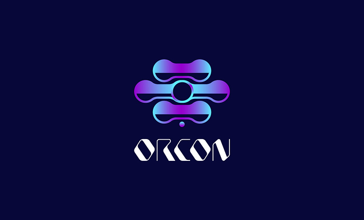
ORCON - Headphone logo
The “ORCON” wordmark appears to use a custom, geometric font style with sharp angles and clean lines, conveying a futuristic and tech-savvy look. The letterforms have distinct cutouts and slanted edges that help them stand out, while still maintaining readability. These design choices reflect modern minimalism and reinforce a cutting-edge brand identity.
The overall design exudes innovation and modernity, making it well-suited for
tech-oriented brands.
The “ORCON” wordmark appears to use a custom, geometric font style with sharp angles and clean lines, conveying a futuristic and tech-savvy look. The letterforms have distinct cutouts and slanted edges that help them stand out, while still maintaining readability. These design choices reflect modern minimalism and reinforce a cutting-edge brand identity.
Design Process
Concept: Sketching symmetrical shapes to symbolize balance, connectivity, and innovation.
Shape: Through iterative drawing, the pill-like forms and central circle were carefully aligned to create a sense of harmony and focus.
Color & Gradient: A vibrant purple-to-blue gradient was selected for its futuristic feel, adding depth and visual interest.
Typography: The custom font was developed to echo the logo’s modern curves and angles, ensuring consistency between the emblem and the brand name.


