Clydebuilt Creative

The Problem: Forgettable Branding Won’t Cut It
Most businesses don’t struggle to get a logo - they struggle to get a brand that works. They settle for aesthetics without strategy, ticking a box instead of building an identity. That’s a problem because weak branding blends in. It fails to shape perception, build trust, or drive growth.
Clydebuilt Creative was built to fix that.
We don’t do cookie-cutter branding. We don’t do trend-chasing. We create brands that last. Bold, strategic, and rooted in craftsmanship. Every identity we build is designed for impact, trust, and recognition. Our own brand had to live up to that same standard.
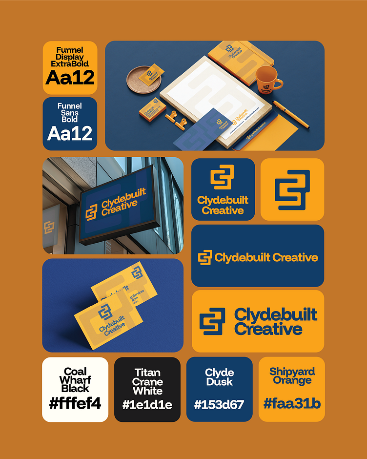
Clydebuilt Creative has to be more than a design studio. It had to be a statement. A brand that signals bold creativity, strategic thinking, and authenticity from the first impression. The visual identity is built around three core principles:
Strong Foundations: Inspired by Glasgow’s industrial heritage, the brand is solid, structured, and built to last.
Bold Impact: Forget soft, forget subtle—this brand is confident, direct, and unafraid to take up space.
Strategic Craftsmanship: Every element is intentional, designed for long-term brand recognition.


At Clydebuilt Creative, we don’t just design logos. We engineer perception. Our own identity had to embody that mindset. The logo mark is more than a symbol, it’s a visual manifesto:
C & B Monogram: A custom mark combining the initials in a bold, structured way.
Flowing River Element: A subtle nod to the River Clyde, symbolising progress and movement.
Brickwork Motif: A reference to craftsmanship, strength, and well-built brands.

We chose Funnel Display ExtraBold for headlines as it's strong, structured, and impossible to ignore. It speaks with authority, just like our brand. Supporting it, Funnel Sans Bold keeps everything sharp, clear, and modern.
We don’t do dull. We don’t do forgettable.
The Clydebuilt Creative colours are deliberate, high-impact, and built for visibility:
🟠 Clockwork Orange – A bold, industrial hue that reflects energy, creativity, and confidence.
🔵 Clyde Dusk – A deep, serious blue representing strength, trust, and professionalism.
⚫ Coal Wharf Black – Sharp, uncompromising, and timeless.
⚪ Titan Crane White – Balanced with off-whites and muted tones for contrast.
