Orbit Getaways
Orbit Gateways - Travel & Tourism Logo Design-Personal Creative Project
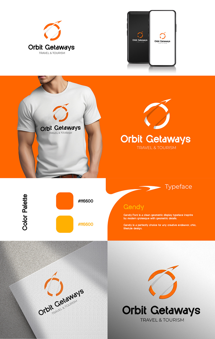
Orbit Gateways is a brand that embodies the thrill of exploration and seamless travel experiences. The logo design reflects movement, adventure, and limitless possibilities, making it a perfect fit for a modern travel brand.
🔹 Concept & Symbolism: The circular shape with an arrow represents global connectivity and continuous motion—essential elements of travel. The clean and modern typography adds a professional yet friendly touch.
🎨 Design Elements: ✅ Color Palette: A dynamic orange gradient, symbolizing energy, enthusiasm, and adventure. ✅ Typeface: Gendy —a geometric display font that enhances the brand’s modern aesthetic. ✅ Versatile Applications: From digital platforms to merchandise, the logo maintains its bold and elegant identity.
💡 Let’s collaborate! If you need a unique logo or brand identity, feel free to reach out!
Designing is my passion, and I'm always excited to take on new projects. If you're looking for a unique creative touch, let’s chat!
