BRANDING: LITTLE MISS RIGHT
Designer : Lu Qin
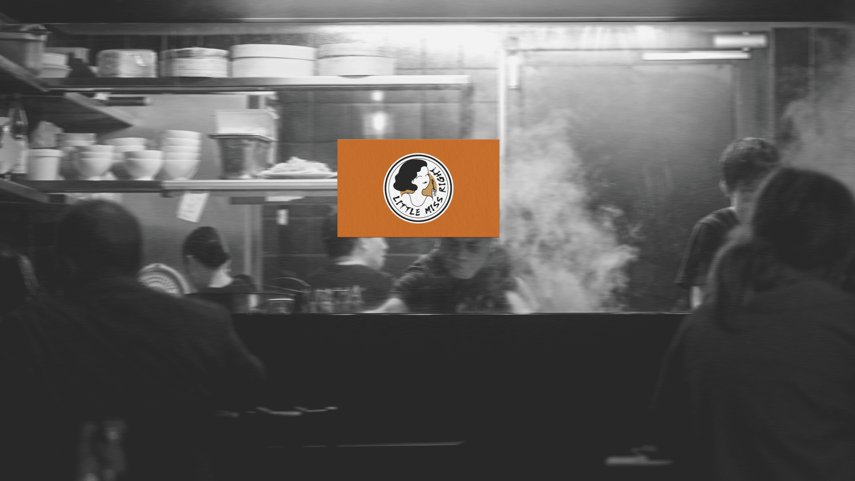
LOGO
The client loved the Chinese creative font I designed but later wanted to incorporate a girl character to enhance the brand’s personality. To introduce diversity and variety while preserving a strong connection to Chinese heritage, I created an alternate logo featuring a round plate-shaped frame with a girl holding a spoon at the center. With a smiling face and short, fluffy hair, she embodies a welcoming, simple, and energetic spirit. The English logo serves as the primary logo, while the Chinese logo acts as a secondary font logo. In the end, I successfully crafted a cute, simple, and modern round logo that visually aligns with the Chinese creative font logo, creating a cohesive and harmonious brand identity.

PATTERN

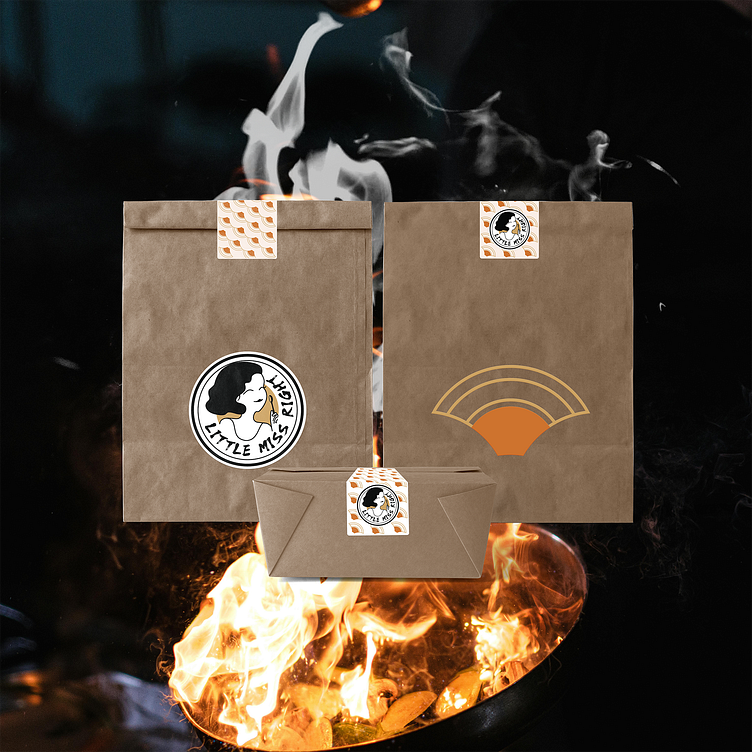
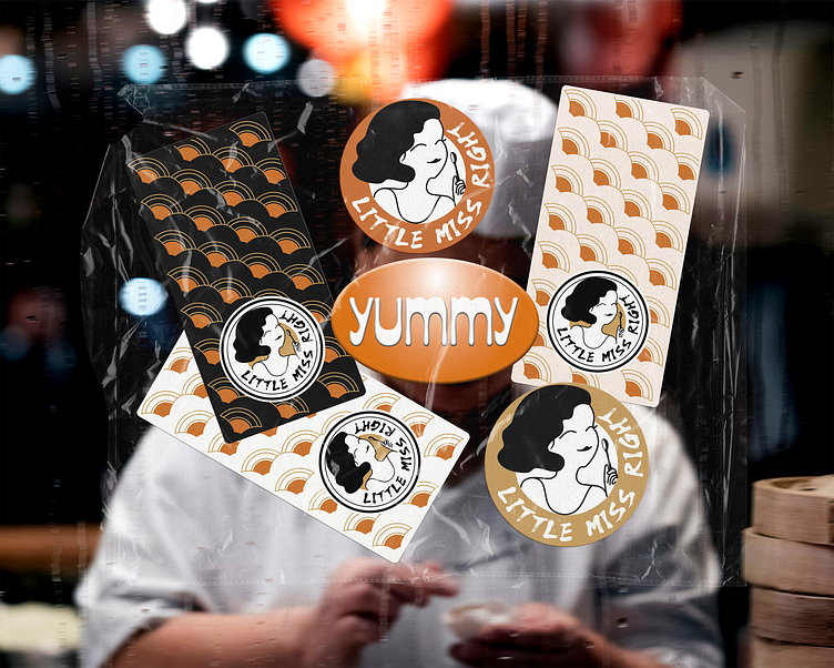
Commercial Application