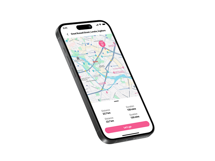
UI 029 - Map Page
Hello everyone! 👋
I have completed my twenty-ninth study. Map Page - Daily UI Challenge #029
Design Analysis
I designed this map screen UI in Figma, focusing on clarity, functionality, and an intuitive navigation experience. The goal was to ensure that users can quickly grasp route details while keeping the interface clean and visually engaging.
1. Map as the Primary Focus
• The map takes up the majority of the screen, ensuring users can easily navigate and find locations. • A subtle, semi-transparent overlay for the bottom details ensures that the map remains the focal point.
2. Minimalist Route Information
• The distance and duration are clearly displayed at the bottom, using a lightweight font to avoid visual clutter.
• I used a duplicated format for distance and duration (probably an early iteration), which could be refined for better hierarchy.
3. Strong Call-to-Action (CTA)
• The “Let’s go” button stands out with a bold color, making it easy for users to take action.
• Rounded edges and a large tappable area ensure accessibility and usability.
4. Navigation Bar & Address Placement
• The location name (“Great Russell Street, London, UK”) is at the top, making it instantly recognizable.
• The minimalist top bar (with back navigation and signal indicators) keeps the interface distraction-free.
This design ensures a smooth and visually intuitive navigation experience, keeping things functional yet aesthetically pleasing. Open to feedback—what do you think?
