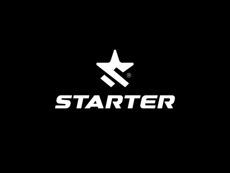
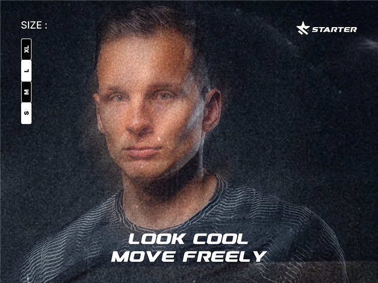
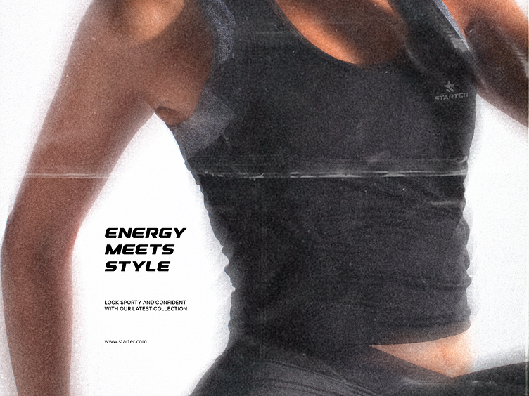
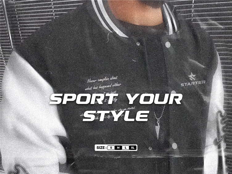
Redesign Logo Starter
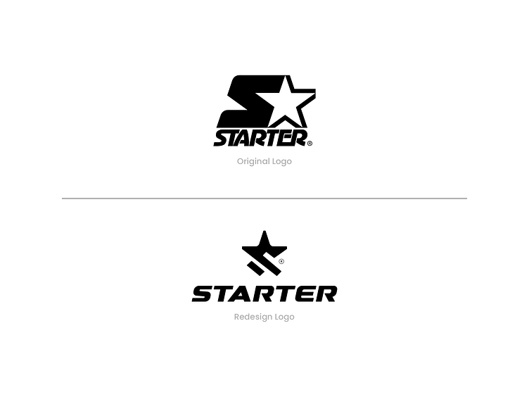
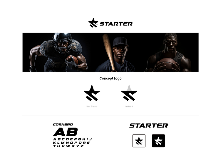
At Garagephic Studio, we always love to challenge the boundaries of creativity. This time, we took on the challenge of redesigning the iconic @starterofficial logo with a more minimalist approach. The original logo was bold, recognizable, and nostalgic, but we wanted to explore how it could evolve to be cleaner and more modern, without losing its strong brand identity.
The redesign removes the heavier elements, focusing on simplicity and balance. Starter’s signature “S” and star are reimagined in sharper, more dynamic shapes to convey a sense of energy and movement. The typography remains bold and sporty, keeping the brand’s sporty heritage alive. This version embraces the minimalist concept without losing the essence of Starter’s iconicity.
This project shows how a logo can be reinterpreted without losing its roots. A good logo should be adaptable, timeless, and still recognizable. What do you think of this new design? Will you wear it on your outfit? Drop your thoughts in the comments!