Claude Logo and iOS App Icon Redesign
Claude is really good - by far the AI tool I use most frequently. Anthropic has been crushing it.
The Claude logo, however, leaves a bit to be desired. I decided to make a quick redesign.
Here's my thought process behind this exercise.
I appreciate the hand-drawn aesthetic of the Claude brand within Anthropic's ecosystem, but the Claude logo just seems sloppy. I understand the "no rounded corners" design, and it seems like it is trying to represent neural pathways.
I appreciate the idea of asymmetry and "imperfection" of the original logo. The execution doesn't quite hit the mark, though.
If the intent is to represent the messiness of thought, I would offer a counter view of seeing the beauty in imperfect, natural things - such as literal nature.
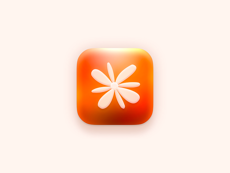
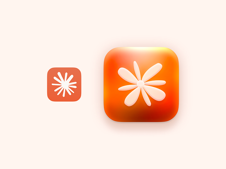
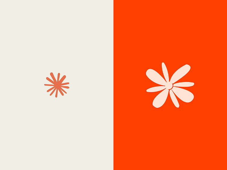
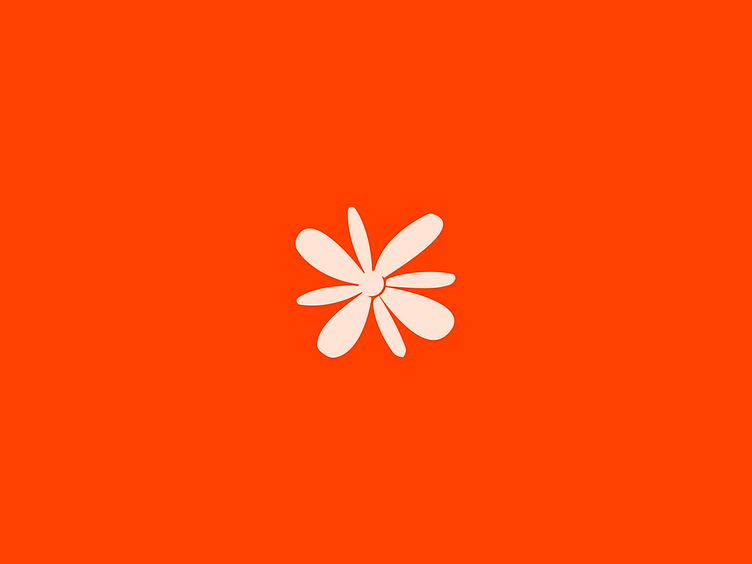
In redesigning the logo, I created a symbol that evokes a flower, but when zoomed out could still be taken as an asterisk or abstract shape.
For the iOS icon, I created separate layers for the different "pedals" or paths of the logo and stacked these elements. Then, adding shadows, I continued to subtly elevate the symbol against the app icon background.