Next Gen VR Banner Design
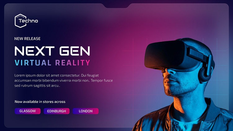
I wanted to create a promotional banner that captures the immersive and futuristic essence of virtual reality technology. The design features a sleek gradient background transitioning between deep purples and blues, complemented by subtle grid lines that add depth and a tech-forward feel.
For the typography, I chose a bold, angular font for "NEXT GEN" to convey innovation and cutting-edge technology, while using a lighter weight for "VIRTUAL REALITY" with a gradient that shifts from cool blue to vibrant pink.
The right side showcases a person wearing the VR headset, bathed in atmospheric lighting that highlights the product while creating an emotional connection. I deliberately used dramatic side lighting to create a cinematic effect that emphasizes both the user and the device.
The location buttons at the bottom use pill-shaped elements with gradient fills that echo the overall color scheme, providing clear call-to-action elements without disrupting the visual hierarchy.
What do you think of this approach for tech product promotion? I'd love to hear your feedback on the color palette and overall composition!
