Futuristic Gaming Identity


Playverse Logo & Branding Design
A Futuristic Gaming Identity
In the competitive world of gaming and digital entertainment, a strong visual identity is crucial. Playverse, a brand dedicated to the gaming universe, has successfully crafted a modern and compelling brand identity that aligns with its vision of immersive and limitless play. The logo, branding elements, and UI integration showcase a sleek and futuristic aesthetic, positioning Playverse as a forward-thinking gaming platform.
Logo Design: A Symbol of Play and Possibilities
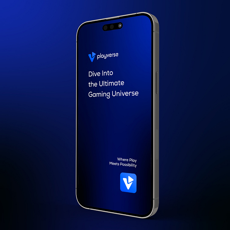
The Playverse logo is a combination of a stylized "V" and a play button, seamlessly merging the essence of gaming with a distinctive brand mark. The triangular play button, subtly integrated into the "V" shape, signifies action, interaction, and engagement—key attributes of the gaming experience. The use of sharp angles and smooth curves ensures a balance between dynamism and sophistication.
Color Palette & Typography: A Digital Futurism Approach
The branding primarily utilizes a deep blue gradient, symbolizing technology, depth, and a vast digital universe. The complementary use of white and lighter blue shades adds contrast, ensuring readability and visual appeal.
The typography is clean, modern, and slightly rounded, making it approachable while maintaining a futuristic edge. The custom font choice enhances brand recall and seamlessly integrates with the digital interfaces of Playverse.
Brand Application: A Cohesive Ecosystem
Playverse’s branding extends beyond just a logo—it forms an entire visual ecosystem.
Website & App UI: The website and mobile interface carry the same design language, with gradient backgrounds, smooth animations, and intuitive UX. The brand’s visual hierarchy ensures that users are drawn to important elements while experiencing an immersive digital environment.
App Icon: The app icon is a compact version of the logo, ensuring recognition even at smaller scales. The addition of notification indicators in the preview highlights real-world usage scenarios.
Marketing & Digital Assets: The branding is seamlessly applied across different digital and marketing assets, including banners, social media, and promotional content. The consistency in design reinforces brand identity and strengthens user trust.
Brand Message & Tagline
"The Verse Where Games Come Alive"—the brand’s tagline encapsulates the essence of Playverse. It emphasizes an expansive universe where gamers can explore, interact, and immerse themselves in limitless possibilities. The subtle gradient in the tagline highlights the evolving nature of gaming and the endless adventures that Playverse promises.
A New Era of Gaming Branding
Playverse’s branding design effectively captures the excitement and dynamism of gaming while maintaining a professional and futuristic aesthetic. The logo, color palette, typography, and UI elements all work together to create a visually cohesive and engaging identity.
This branding serves as a benchmark for modern gaming brands, proving that a well-thought-out design can elevate a brand’s perception and create an emotional connection with its audience. With Playverse, gamers are not just players—they are part of an evolving digital universe.
