E-commerce store
Hello everyone! 👋
I have completed my twelfth study. E-commerce store - Daily UI Challenge #012
E-commerce Shoe Store UI Design Analysis
I designed this e-commerce shoe store interface in Figma, inspired by Nike and Trendyol’s mobile shopping experiences. The goal was to create a clean, intuitive, and visually appealing layout for users looking to purchase sneakers
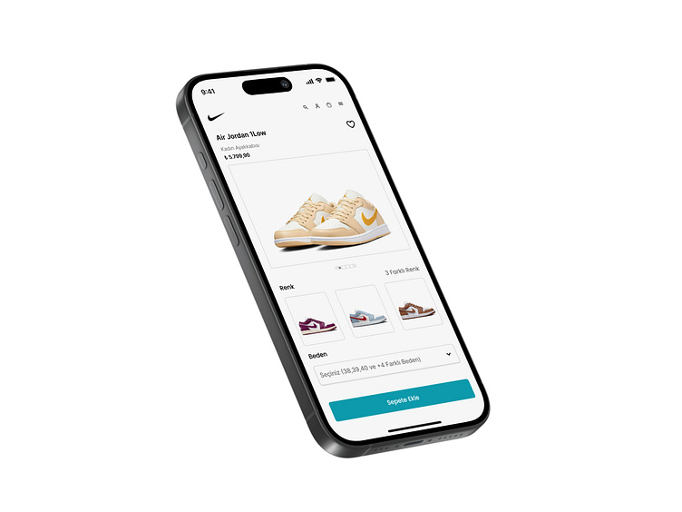
Header & Brand Identity
At the top of the screen, the Nike logo is prominently placed, reinforcing brand recognition. Next to it, there are essential navigation icons, including search, user profile, and shopping cart, ensuring quick access to key functionalities.
Product Details Section
The product title, “Air Jordan 1 Low,” is displayed in a bold, easy-to-read font, followed by a brief category label, “Women’s Shoes,” making it clear that this product is designed for women. Below that, the price is shown in a visually distinct way, ensuring users immediately notice the cost.
Product Image & Color Variants
The main section features a high-quality image of the shoe, allowing users to see the design and colors in detail. Below the image, a carousel indicator (small circular dots) provides visual feedback that users can swipe through additional product images. Additionally, a color variation section is present, displaying three different colorways of the shoe in small preview thumbnails. This enables users to quickly explore different styles without navigating away from the page.
Size Selection Button
A dropdown menu is available for selecting the shoe size, which includes commonly available sizes. This makes the purchasing process more streamlined, allowing users to pick their size without unnecessary scrolling.
At the bottom, the “Add to Cart” button is designed in a bright and attention-grabbing color, ensuring users can easily find and interact with it. The button is wide enough to be tapped comfortably on mobile screens, following good UX design principles.
Additional Features
On the top right corner, a favorite (heart) icon allows users to save the product for later, catering to those who want to browse before making a purchase. This small but essential feature helps enhance the overall shopping experience.
Overall User Experience
The design follows a minimalistic approach, ensuring a smooth user journey. The hierarchy of information is well-structured, guiding users from product details to purchasing actions naturally. The contrast, typography, and spacing make the content highly legible, while the product images remain the focal point.
By balancing aesthetics with usability, this design effectively creates a seamless and engaging shopping experience.
