The Juicy Crab - Sea Food Restaurant Website Design.
The Juicy Crab website 🦀, a seafood restaurant chain with over 50 locations. The project aimed to optimize the online ordering experience, and drive sign-ups for the Juicy Rewards loyalty program. By leveraging high-quality imagery, bold call-to-actions, and interactive elements, the redesign establishes a seamless digital experience tailored to the brand’s vibrant identity. The focus was on creating a visually inviting yet functionally robust platform that caters to both new and returning customers.
UX Challenges
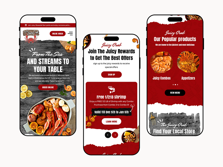
Mobile-First Optimization
With 90% of users accessing the website via mobile, ensuring a seamless and intuitive experience on smaller screens was critical.
The design needed to balance high-quality imagery with fast-loading performance to avoid slow page speeds.
Simplifying the Ordering Process
Users needed a clear and frictionless path to place orders without distractions or unnecessary steps.
CTA buttons for ordering and catering had to be highly visible without overwhelming the design.
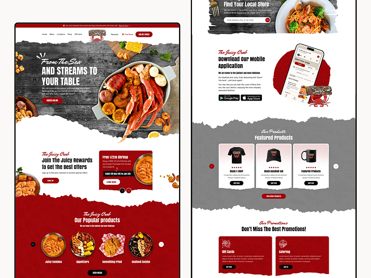
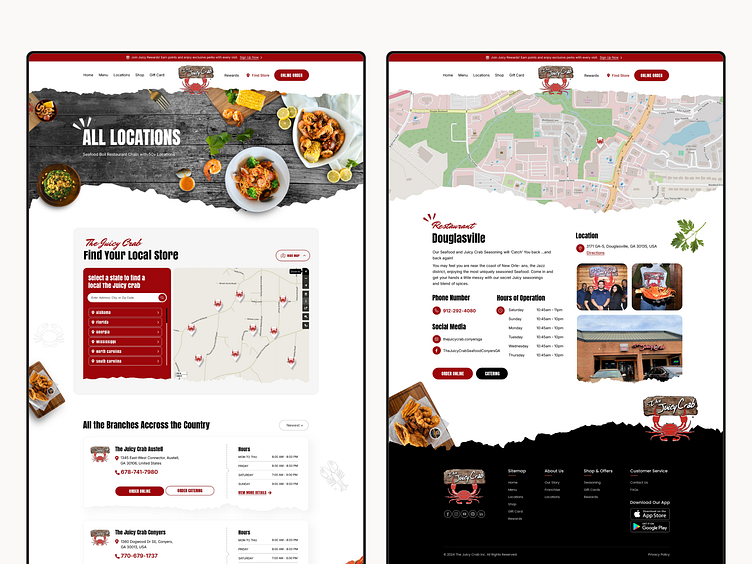
Enhancing Location Discovery
With multiple restaurant locations, users required a fast and intuitive way to find the nearest branch.
Implementing a non-Google map (OpenStreetMap) while maintaining usability and performance posed a technical challenge.
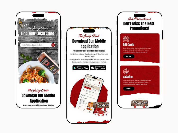
Encouraging Loyalty Sign-Ups
The Juicy Rewards program needed to be prominently featured to drive sign-ups and mobile app downloads.
Users had to quickly understand the value of the program without reading excessive text.
Avoiding Clutter While Showcasing Key Features
The website had to highlight multiple key elements—menu, online ordering, rewards, promotions, catering, seasoning, and gift cards—without overwhelming users.
A balance between visual hierarchy and whitespace was essential to maintain clarity.
UI Design Key Insights
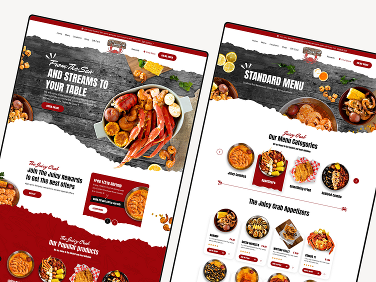
✅ High-Quality, Lively Visuals
Large, appetizing food images were used to immediately capture user attention and reflect the restaurant's fresh seafood offerings.
The color scheme incorporated vibrant, seafood-inspired tones to maintain brand identity and visual appeal.
✅ Bold and Intuitive CTAs
Buttons for “Order Online,” “Join Juicy Rewards,” and “Find a Location” were placed strategically for easy access.
The use of contrast ensured CTA buttons remained noticeable without being intrusive.
✅ Interactive and Engaging Elements
Hover effects, smooth scrolling, and subtle animations made navigation feel more dynamic.
Interactive menu categories allowed users to explore different offerings without excessive clicks.
✅ Streamlined Navigation for Quick Access
A sticky navigation bar ensured users could access important features at any point during browsing.
Clear sections for each main feature (Menu, Locations, Rewards, Promotions) created a structured user journey.
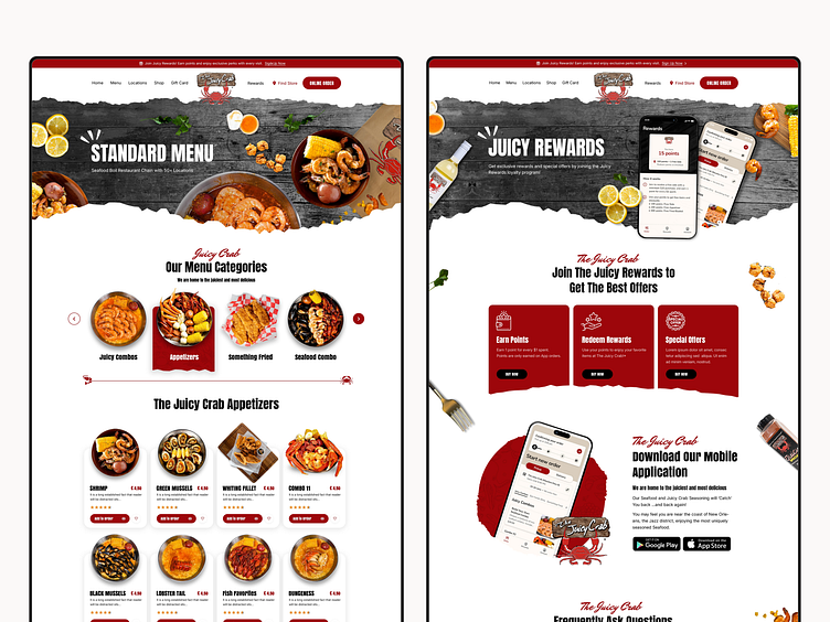
✅ Visually Engaging Loyalty Program Section
The Juicy Rewards page featured large app mockups to emphasize its mobile-first approach.
A step-by-step breakdown of the program benefits made it easier for users to understand and take action.
Key Features
Mobile-First Responsive Design: Ensured smooth navigation, fast loading, and an intuitive UI across all devices.
Enhanced Online Ordering Flow: Simplified process with fewer steps to increase conversion rates.
Interactive Location Finder: Users could search by city or zip code and view locations on OpenStreetMap.
Vibrant, High-Quality Food Imagery: Enticing visuals played a key role in engaging users and boosting conversions.
Juicy Rewards Integration: A visually appealing rewards section highlighting benefits and encouraging sign-ups.
Seamless Navigation and CTA Optimization: Strategically placed CTAs for ordering, reservations, and rewards program.
