Strategic Homepage Redesign

How HomeBuddy Increased Conversion Rates by 65% Through Strategic Homepage Redesign
My Role: Exploration, UX Testing, Design, Implementation
Team: Product Manager, Tech Team
Duration: 2 months
Overview: HomeBuddy, a platform that connects homeowners with trusted local contractors, aimed to enhance its homepage to boost engagement and conversions. The existing design lacked clarity, failed to convey its core value effectively, and struggled with low conversion rates. Leveraging insights from online data tools, the challenge was to refine the homepage experience to build trust and drive higher user engagement.
Problem: A detailed analysis using Hotjar, Clarity, and Google Analytics revealed key issues:
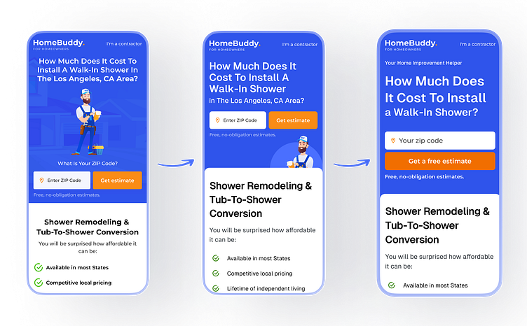
CTA Placement & Visibility Issues: The "Get Estimate" button was positioned too low, reducing engagement. The color blended into the background, making it less noticeable.
High Drop-Off Rate in Key Funnel Areas: Many visitors abandoned the page before interacting with the CTA, indicating a lack of clear direction.
Lack of Immediate Trust Signals: Visitors hesitated due to the absence of visible reviews, certifications, and guarantees above the fold.
Inefficient Content Hierarchy: The page had too much dense text, making it hard for users to quickly grasp HomeBuddy’s benefits.
Mobile Performance Issues: Heatmap data showed that mobile users struggled with tapping on CTAs due to cluttered spacing and poor responsive design.

Solution: A series of data-driven design improvements were implemented:
1. Optimized CTA for Maximum Engagement:
Moved the “Get a free estimate” button above the fold and changed its color to a high-contrast orange to stand out. Increased button (and font) size and added whitespace around it to improve visibility and accessibility.
2. Simplified Content & Improved Readability:
Reduced text density by breaking information into short bullet points and headers.
Implemented an F-pattern layout to guide the user’s eye through the most important content.
3. Reinforced Trust & Credibility:
Displayed customer testimonials, certifications, and guarantee badges prominently above the fold.
Used real images of homeowners receiving services instead of stock photos to increase authenticity.
4. Enhanced Mobile Usability:
Adjusted button spacing and improved touch responsiveness for a better mobile experience.
Removed unnecessary elements that were causing clutter on smaller screens.
5. Improved Navigation Flow:
Simplified navigation by eliminating non-essential sections and using collapsible menus for additional details. Introduced multiple CTAs with varied copy to capture different user intents.


Conclusion: By leveraging online data tools instead of direct user testing, HomeBuddy successfully identified and addressed major conversion barriers. The homepage redesign significantly improved usability, trust signals, and engagement, resulting in a substantial increase in conversions. Future iterations will focus on further personalization, A/B testing of CTA variations, and refining the mobile experience for continued growth.

