Visual identity "LEONID WOODWORKS"

About Project
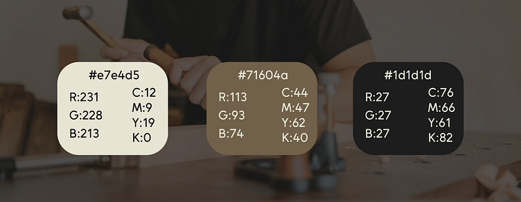
Leonid, the company's CEO, has loved wood since childhood and his skilled hands transform it into beautiful interior elements and quality furniture. In his small workshop in England, he creates not only products, but also joy and quality with care and responsibility. Leonid wanted a visual identity that reflected the values of his life: family, nature, home, peace, warmth and quality. My task was to develop an individual and high quality visual identity with the message: 'Wood products for a naturally elegant lifestyle - made with love and care for quality'. The visual identity concept is based on the aesthetics of nature and wood, using natural brown tones, wooden textures and organic shapes that create a feeling of cosiness and comfort.


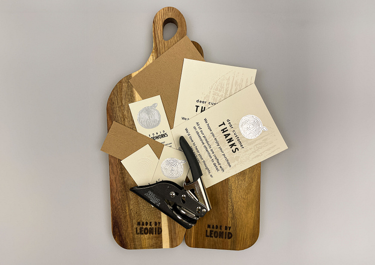
The logo is a combination of tree bark, leaf and fingerprint, symbolizing man's connection with nature, sustainability, handmade and uniqueness. The typeface is inspired by Rawles Regular, but with modifications to give a rough, free form look that emphasizes the company's style. The focus is on the word "Woodworks" for a clear understanding of the company's line of business.