From Manhattan with Love: Redesign an Interior Design Site

We’re sharing how a website redesign turned a simple portfolio into a premium digital experience, on par with high-end interior design magazines. This project seamlessly blended the aesthetics of print publications, intuitive navigation, and modern technology to emphasize the studio’s exclusivity and professionalism.
United Elite Group is a New York-based company specializing in luxury property renovations, handling everything from planning and visualization to the execution of complex architectural solutions. Their clients are owners of high-end homes who appreciate architectural aesthetics and functional spaces.
The main goal of the project was to elevate the company’s website beyond a standard portfolio showcase — transforming it into an immersive digital experience that highlights the team’s expertise and high-end craftsmanship. The new website needed to be intuitive, contemporary, and inspiring — like flipping through the pages of a glossy interior design magazine.
The result? A project that masterfully combines the refined elegance of print media with cutting-edge digital technology, turning the portfolio browsing experience into an immersive journey through the world of luxury design.
Who Is Our Audience?
We designed the website for affluent families and owners of "dream homes" in New York’s historic districts. We drew particular inspiration from brownstone homes, whose owners frequently turn to United Elite Group for renovation projects.
What Matters to This Audience:
1. Unique design solutions and aesthetics.
2. User-friendly navigation and well-structured portfolios.
3. Visual content on par with high-end interior design magazines.
Our goal was to create a website that reflects the values and lifestyle of our clients.
Design as an Ode to Print Aesthetics
We drew inspiration from high-end magazine layouts and adapted them for the digital space.


Key Design Decisions for United Elite Group’s Website
During the redesign process, several key decisions shaped the final result:
Modular Grid: A well-structured layout ensured a clean and intuitive interface. This approach not only helps users navigate the site effortlessly but also enhances the elegance of the content.
Typography: A combination of classic serif fonts for headings and modern sans-serif for body text creates a balance between tradition and contemporary aesthetics. This choice reinforces the premium feel and improves readability.
Just compare the new design to the old one — we removed the heavy dark background and introduced more white space. The stylish typography further enhances the website’s high-end appeal.

Emphasizing Negative Space The spacing around text and images highlights key elements, making the website visually light and “airy.”
Classic Magazine-Style Navigation We incorporated design elements
inspired by print publications. Section labels and page numbers create a structured feel and simplify navigation between content blocks. Full-width images enhance the visual impact, immersing users in the world of high-end interior design.
These decisions not only gave the website a refined aesthetic but also made it functional and user-friendly.
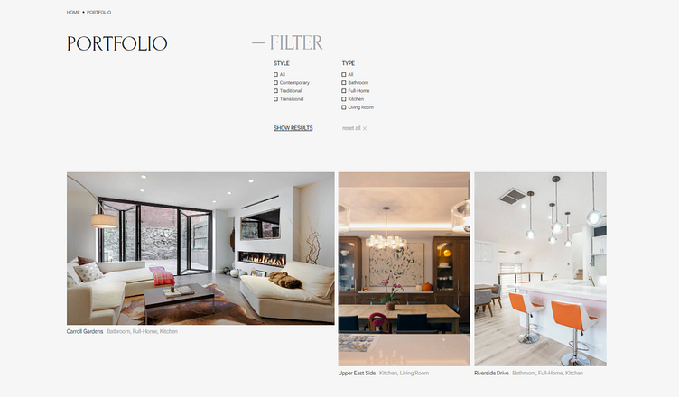
Portfolio Section Design
To make the portfolio section both user-friendly and inspiring, we focused on simplicity and intuitive navigation. First, we conducted a semantic analysis to identify popular design trends and audience search queries. Based on this data, we restructured the portfolio, replacing generic tags with filtering options by style and room type. This allows users to quickly find the projects they’re interested in — from elegant kitchens to stylish living rooms.
Project Page
The project page design sets the standard for clarity and informativeness. Large-format interior photographs showcase every detail of the finishes and material textures. Below the images, a brief project description highlights unique architectural solutions and premium materials.
What Makes the Page Truly User-Friendly
Clear Structure: The photos guide the user seamlessly through key interior zones.
Visual Storytelling: A smooth narrative through images conveys the project’s philosophy without excessive text.
Easy Navigation: Quick access to other projects via links at the bottom of the page.
These elements transform the project showcase into an immersive visual journey through luxury renovations.

Blog Pages — Minimalism with a Glossy Touch
The designers chose a style that emphasizes clarity and modernity: a clean layout with plenty of white space. This approach prevents visual overload and creates a sense of lightness.
Each article is paired with large, high-quality photographs that capture attention and set the right mood. The minimalist design keeps the focus on content, with bold, expressive headlines free from unnecessary embellishments—making navigation effortless.
Articles feature generous spacing around text and images, ensuring a comfortable reading experience. Content is divided into sections with prominent headlines, while images play a central role—sometimes filling the entire screen, like in the article on kitchen design trends.


Results: Elegant Design That Enhanced UX and Strengthened the Brand’s Image
The redesign of the blog and overall website delivered outstanding results, perfectly reflecting the refined and modern character of the company. The elegant and minimalist approach not only reinforced the brand’s style and professionalism but also created an intuitive, comfortable experience for users.
Key Outcomes:
1. Our designers crafted a visual solution that improved content perception while enhancing user experience.
2. A 25% decrease in bounce rate demonstrates that improvements in design and navigation significantly boosted UX and site logic.
3. Positive feedback from partner architects confirms that the design effectively conveys the company’s sophistication and professionalism — an essential factor in building strong industry relationships.
