Landing Page for Course Website
Hey Dribbble Community! 👋
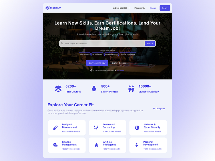
Quick breakdown of the hero section for this online course landing page. The goal? Hook users fast and keep them exploring. Here's the thinking behind the design choices in this prime real estate:
Headline: "Learn New Skills, Earn Certifications, Land Your Dream Job!"
Choice: Bold, benefit-driven, and speaks directly to user aspirations.
Retention Boost: Immediately grabs attention by promising tangible outcomes learners crave. Many sites are vague; this is direct and motivating.
Sub-headline: "Affordable online courses with guaranteed placements"
Choice: Addresses key pain points and desires - cost and job prospects.
Retention Boost: Builds trust and value proposition upfront. "Guaranteed placements" is a major differentiator that keeps users interested.
Search Bar (Prominent & Simple): "What do you want to learn?"
Choice: Easy to find and use, inviting users to immediately engage.
Retention Boost: Reduces friction. Users can quickly find what they're looking for instead of getting lost in menus.
"People Searched for" Section (Trending Categories): Data Science, UI/UX Design, etc.
Choice: Shows popular, in-demand courses, sparking interest and exploration.
Retention Boost: Provides instant course suggestions, especially helpful for users who are unsure where to start. Keeps them Browse longer.
Clear CTAs: "Start Learning Now" & "Explore Courses"
Choice: Two distinct calls to action for different user intents (ready to commit vs. just Browse).
Retention Boost: Provides clear next steps, guiding users further into the site. No confusion about what to do next.
Background Image (Aspirational & Relevant): Subtle, professional, hints at a learning environment.
Choice: Visually appealing without being distracting. Supports the overall message of growth and learning.
Retention Boost: Creates a positive first impression and reinforces the platform's purpose. Avoids generic stock photos that don't resonate.
Why this might outperform others:
Many online course sites have cluttered hero sections, generic headlines, or unclear navigation. This design prioritizes:
Clarity: Easy to understand the core offering within seconds.
Value: Immediately highlights key benefits (skills, jobs, affordability).
Actionability: Clear pathways for users to explore and engage.
Essentially, it's about respecting the user's time and making it effortless for them to see the value and take the next step.
Thoughts? Always curious to hear your perspectives on hero section design! 😊
#DailyUI
