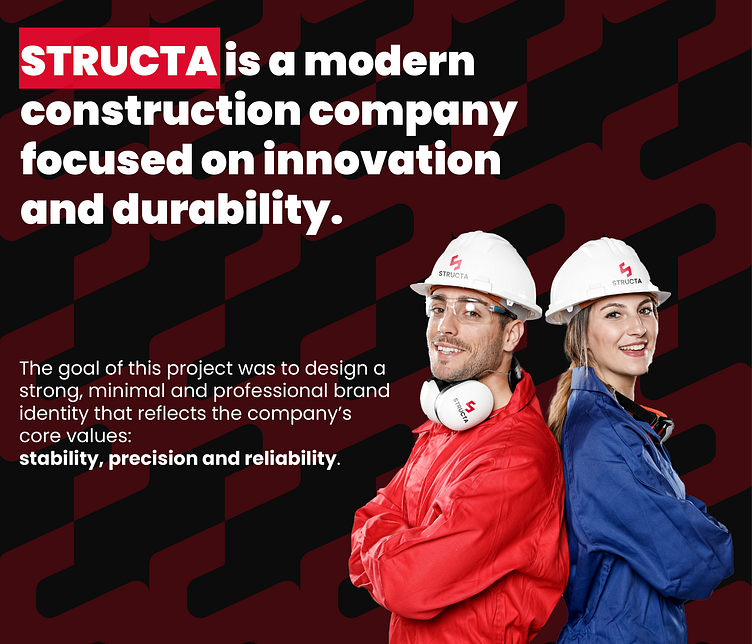
Structa – Logo for a Construction Company
Concept & Logo Design
The logo was designed using a grid system to create a balanced and structured form. It represents both the letter “S” from STRUCTA and a solid, architectural structure, symbolizing strength and stability in construction.
The sharp angles and geometric design reflect modern engineering and precision, while the minimalistic style ensures versatility across different applications
This project was a great in creating a bold yet minimal brand identity. STRUCTA now has a visual identity that aligns with its core values and ensures strong recognition in the industry.
Thank you!
More by KND View profile
Like


