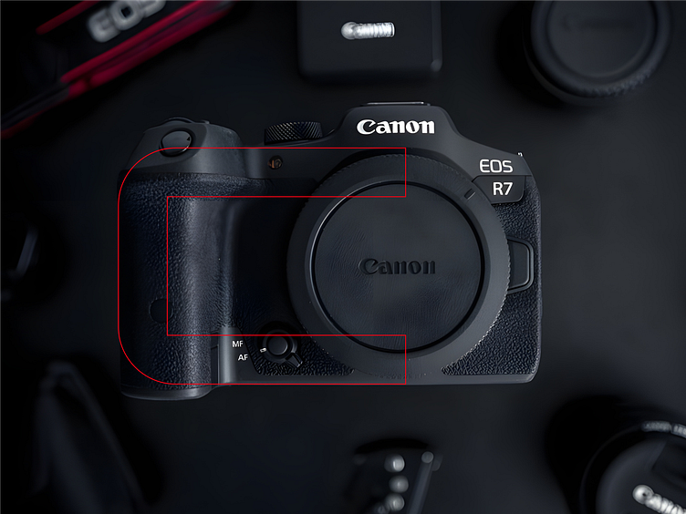
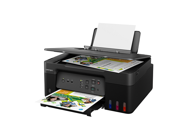
Redesign Logo Canon

After redesigning the Canon logo, we didn’t stop there! We wanted to bring the new identity to life by creating a fresh visual appearance that fits the brand’s evolution. The idea? A modern, minimal, and sleek look while still keeping the strong legacy of Canon alive.
We played around with typography, layout, and UI elements to make sure everything feels cohesive with the new branding. The goal is to create a design language that not only looks good but also feels timeless and professional. A fresh take for a legendary brand!
So, what do you think? Do you vibe with this new look, or do you prefer the classic Canon style? Let’s discuss in the comments!