4 Thumbnail Design Fails That Are Hurting Your YouTube Channel
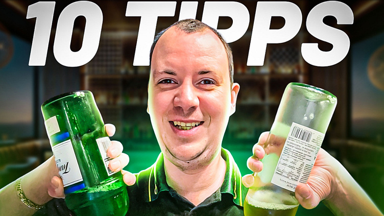
4 Thumbnail Design Fails That Are Hurting Your YouTube Channel
Your YouTube thumbnail is your channel’s first impression—a mini billboard that either invites viewers in or drives them away. Unfortunately, many creators unknowingly sabotage their own success with poor thumbnail design. Let’s break down four common design fails and explore how to fix them to boost your click-through rates and channel growth.
1. Cluttered and Overwhelming Design
The Problem: Overloading your thumbnail with too many images, texts, or visual elements makes it hard for viewers to quickly grasp your message. When your design feels chaotic, potential viewers may simply scroll past your video without a second thought.
The Fix:
Keep It Simple: Focus on one or two main elements.
Clear Focal Point: Ensure your design has a clear center of attention that hints at your video’s content.
Whitespace is Your Friend: Use negative space to separate and highlight key elements.
2. Low-Quality Imagery
The Problem: Blurry or pixelated images scream unprofessionalism and can hurt your channel’s reputation. A low-quality thumbnail may also fail to catch the eye in a sea of high-quality content.
The Fix:
Invest in Quality: Use high-resolution images that remain crisp, even on larger screens.
Relevant Visuals: Choose visuals that accurately represent your content, ensuring that what you promise in your thumbnail is what viewers get in the video.
3. Unreadable or Overdone Text
The Problem: Text is a powerful tool in a thumbnail, but if it’s too small, overly fancy, or lacks contrast, your message can get lost. Overdoing text—either by using too many words or multiple font styles—can confuse viewers rather than inform them.
The Fix:
Be Concise: Use a short, punchy headline (3-5 words max) to communicate your video’s value.
Readable Fonts: Choose bold, clean fonts that stand out.
Contrast Matters: Ensure your text contrasts well with the background for clarity across all devices.
4. Inconsistent Branding
The Problem: If your thumbnails don’t share a consistent style or color scheme, viewers may not immediately recognize your content. A lack of branding can diminish your channel’s identity and trustworthiness.
The Fix:
Develop a Signature Style: Stick to a consistent color palette, font, and layout that reflects your channel’s personality.
Create Templates: Use design templates to streamline the process and maintain consistency across all your videos.
Reinforce Your Brand: Include subtle branding elements (like a logo or unique border) that help your content stand out as uniquely yours.
Final Thoughts
Your thumbnail is more than just an image—it’s a crucial tool in attracting and retaining viewers. By addressing these four common design fails, you can create thumbnails that not only look professional but also convert impressions into clicks.
Ready to transform your thumbnails and skyrocket your views? Tackle these design issues one by one, and watch your channel’s engagement soar!
Contact Information Email:
📧 [email protected] 📧 [email protected]
WhatsApp: 📱 +8801312934297 📱 +8801750865481
Social Media: 🔗 Instagram 🔗 LinkedIn 🔗Whatsapp🔗
Services:
✔️ YouTube Thumbnail Design
✔️ YouTube SEO Optimization (7-day & monthly packages available)
✔️ Channel Growth Strategy & Optimization
✔️ Video SEO for increased views and engagement
✔️ Custom Video Thumbnails (for all types of videos)
Business Hours: ⏰ Saturday- Friday: 9 AM - 6 PM (GMT+6)
Payment Methods: 💳 PayPal, Bank Transfer, Bkash, and other local payment methods are available.
